Blog Insights
A Map Isn’t Always the Best Way to Explain Your Data
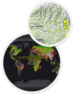
As far as data visualizations go, I’m perfectly primed to be a huge fan of data maps. And I am. From human population growth over time with ArcGIS, to realtimeaid support to survivors in Nepal with OpenStreetMap, a map can truly be worth of a thousand words explaining detailed results and spurring calls to action in just a few shorts moments.
That said, I was sitting with some colleagues last week and as we grappled with the design of a data map, we came to the realization it may actually not be the right solution. We were definitely comparing data points across geographic regions, but the message we wanted to convey was actually more clearly shown in a bar chart. Despite wanting the map to be the ultimate data visualization, it won’t always be the right choice (how disappointing for me, right?).
As organizations and companies charge forward with the open data movement, maps are the number one things people want to see front and center on their websites and reports. The map lover in me couldn’t agree more! But the practical side of me says you should ask yourself: Is this the right kind of graphic? Does it convey the point I’m trying to get across? Would another visualization be clearer? Does a visualization even make sense here? Based on these questions, there are a few things you need keep in mind before trying to mapify your data:
Focus on your message.
That is, don’t forget what you want to show and why. Do you want to demonstrate the uptake of a certain public service? Compare data to suggest where new budget lines should focus? Show where schools are located versus major village populations? As you design your map, always come back to the reason you’re creating it in the first place.
Stick to a small number of data types.
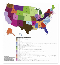
Trying to show 15 different data types on a map is way,way too confusing. Two is easy, three to four is doable, but when you’ve got 10+ data types that the viewer needs to decipher, maybe a line chart would make more sense. As an example, this recent map explaining causes of death across America couldn’t be more confusing with 23 (!) different (and somewhat strange) data types. (map: Causes of Death in America, Washington Post)
Use clear graphics and icons.
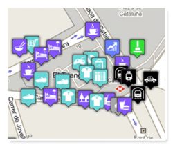
Many maps go beyond points and include image icons, e.g., a big H to show hospitals. These can often be really helpful, but don’t go crazy with it—too many markers are overwhelming, and just like having too much data won’t help you get your point across. (Map: From Google Maps icon page)
Say one thing at a time.
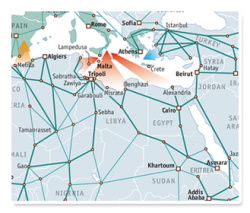
If you want to get one point across, focus on that. Don’t send your viewer’s eyes in all directions, it can be confusing otherwise. (Map: Europe’s Boat People, The Economist)
Test it out.
Show the map to your colleagues, friends, and QA testers and ask them to tell you what they see. If the first thing they say is what you wanted to illustrate, you’re on your way. If it isn’t, test it some more and modify as necessary. Message over beauty!
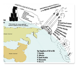
Keep it simple, above all.
Great design can make beautiful maps, but the more extravagant you try to go, the less impact you’ll ultimately have. (Map: The Fossil Fuel Fix, AIR)
Maps are truly wonderful tools to visualize data. They’re beautiful, they’re recognizable, they’re fascinating, and (gosh darnit!) people like them. If a data map is the best and most useful way of demonstrating what is you want to say, then by all means, keep the above six points in mind and map away!
And just for fun, have a look at WTF Visualizations for a few examples of when maps and other types of visualizations go off the road, and Vox’s 27 Hilariously Bad Maps, although some of the maps certainly do serve their hilarious messaging purpose (like this one). And let us know—what are your favorite data maps?