Blog • Insights
Approaching a Rebrand From the Ground Up
For large organizations that have been around for multiple decades, there comes a time when refinements in strategic vision demand the need for an updated brand to propel the vision.
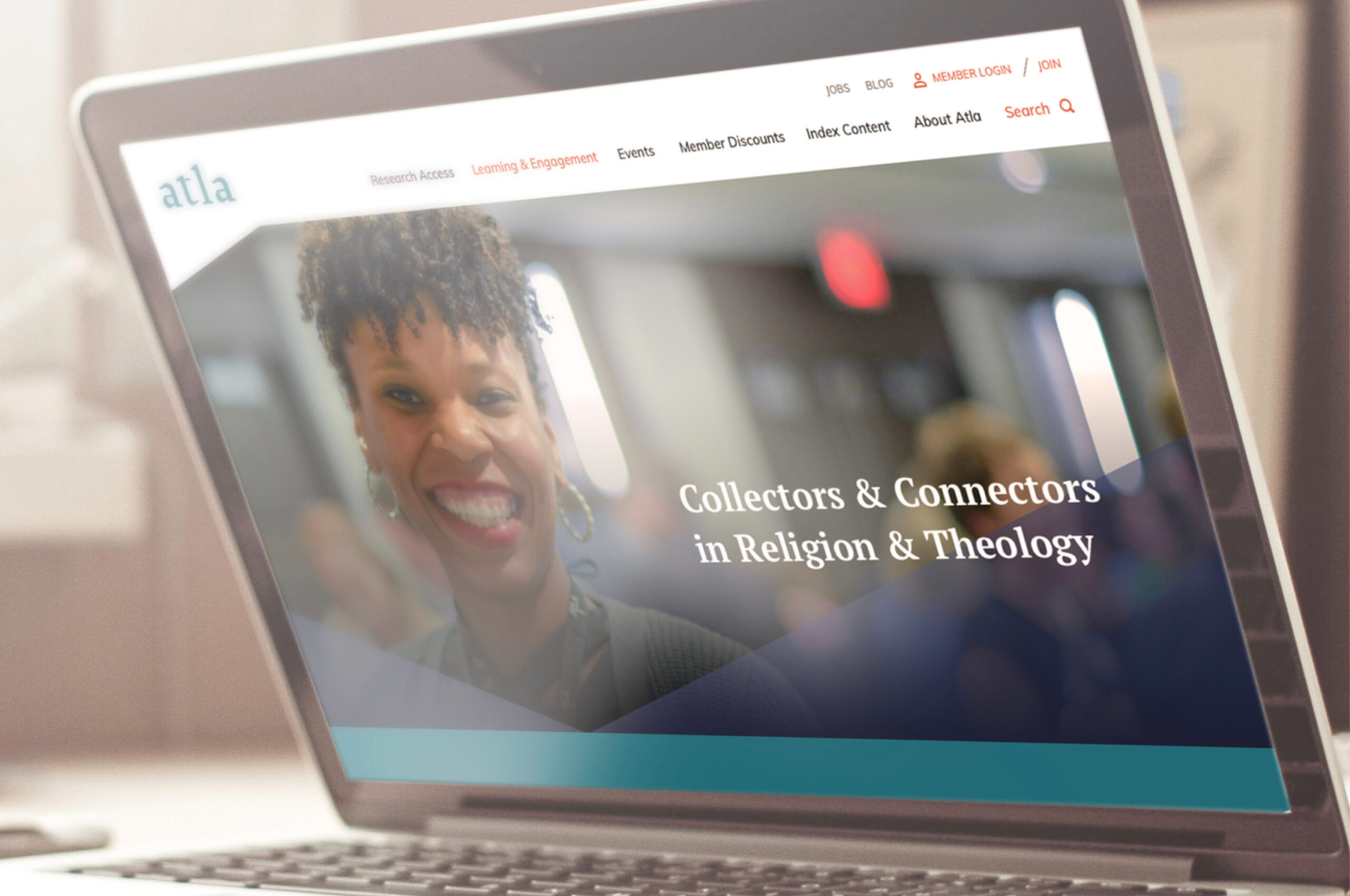
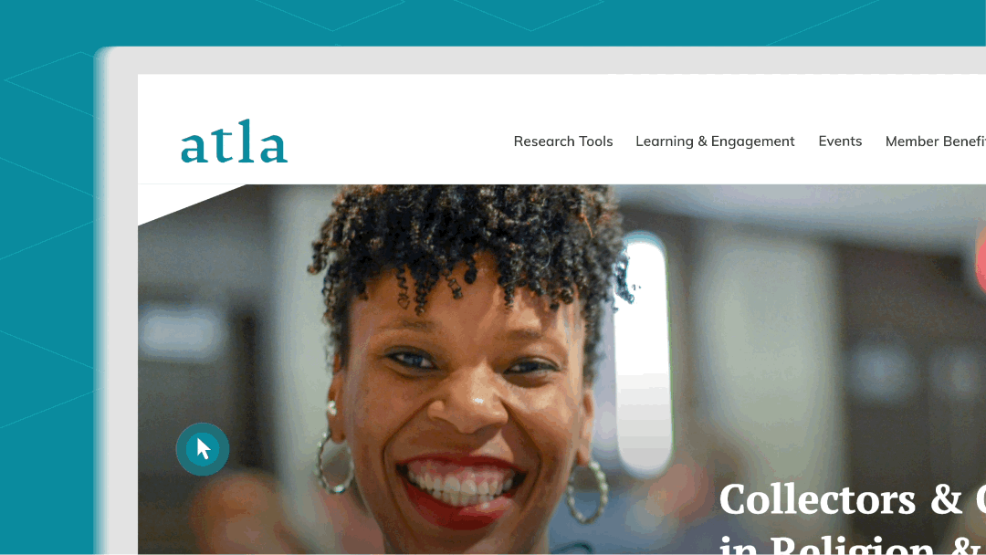
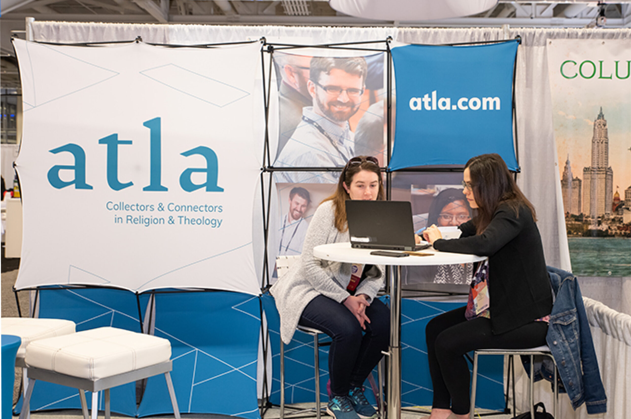
Forum One recently worked with Atla, formerly known as the American Theological Library Association, to completely rebrand and launch their website. Atla is committed to advancing the study of religion and theology as a membership association with 800 members, including librarians and information professionals, and as a producer of research tools.
 Our work spanned naming, logo, messaging, tagline, multi-channel collateral design, brand rollout, and the redesign and development of the Atla website (and in case you’re curious from a technical platform perspective, atla.com runs on WordPress).
There are quite a few great examples from Atla’s approach to re-branding that you can learn from as you consider embarking on a partial or full re-brand, so let’s walk through these key examples.
Our work spanned naming, logo, messaging, tagline, multi-channel collateral design, brand rollout, and the redesign and development of the Atla website (and in case you’re curious from a technical platform perspective, atla.com runs on WordPress).
There are quite a few great examples from Atla’s approach to re-branding that you can learn from as you consider embarking on a partial or full re-brand, so let’s walk through these key examples.
Starting with research and definition
Atla approached this comprehensive project by first identifying the need to reimagine their strategic vision to more effectively reach global audiences with an inclusive brand experience—this scope as evolved in their long history programmatically. Our team helped them build on these established brand opportunities by assessing the current brand experience through the lens of their team and their key audiences and established their position in the current landscape of similar organizations. A key part of this process was conducting brand perception testing with key audiences, extensive comparator and competitor analysis, and an assessment of Atla’s internal messaging and communications. We developed a set of recommendations based on this research that focused on reimagining Atla’s brand identity and experience.Positioning Atla as a global brand
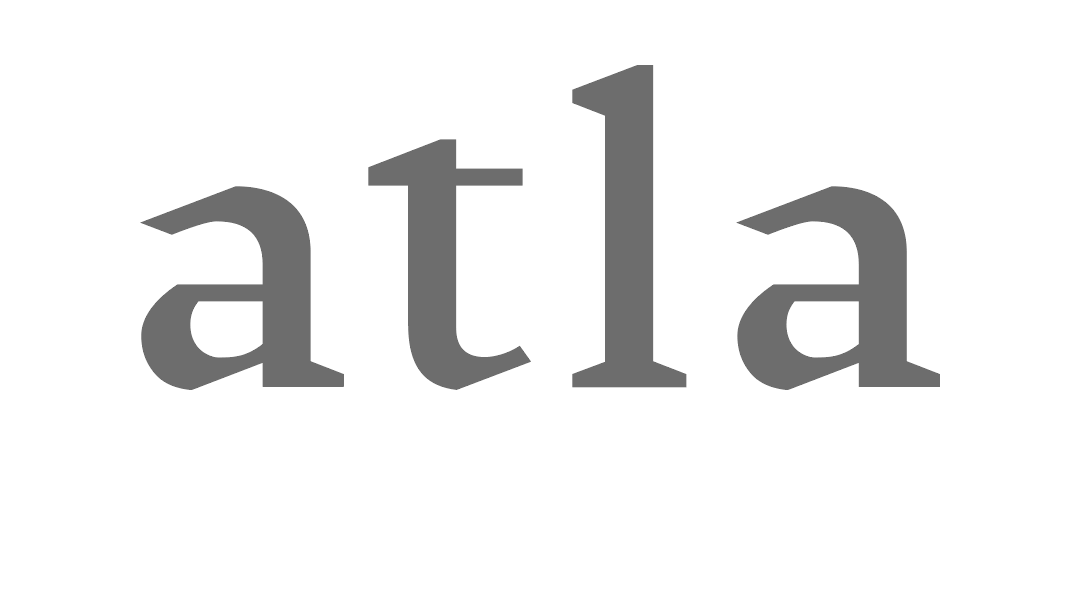
The name
The acronym, ATLA, was derived from the original name, the American Theological Library Association. It was clear from the research phase that two words in the former name, “American” and “Theological,” were hindering the strategic direction of being seen as global and inclusive.The solution: American Theological Library Association (ATLA)
↓
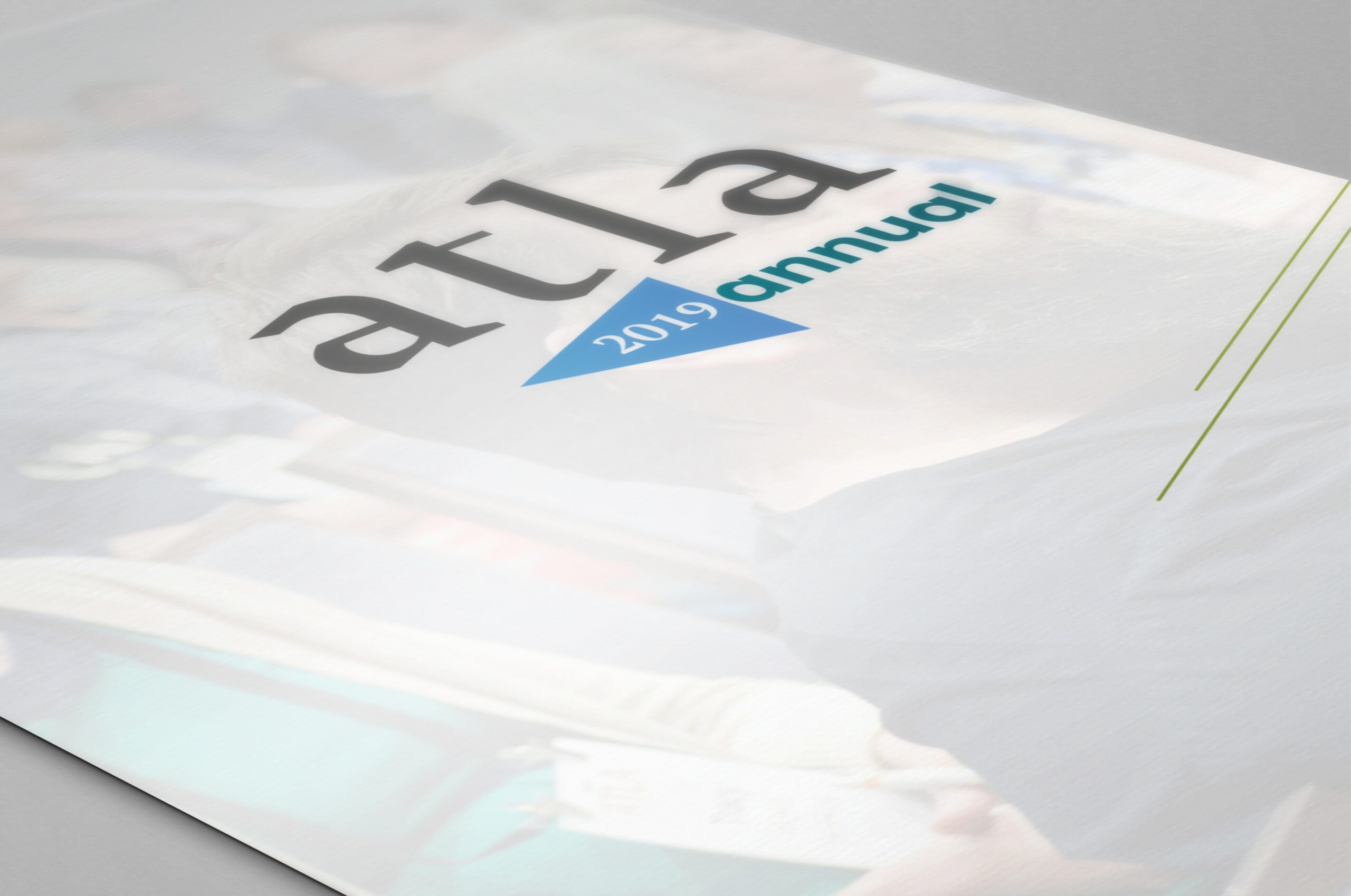
Atla (a non-acronym word)
Audience members identified a strong connection to the word Atla. Though some people were saying the name as four letters as a true acronym, more people were already shortening the acronym in speech to Atla.The tagline
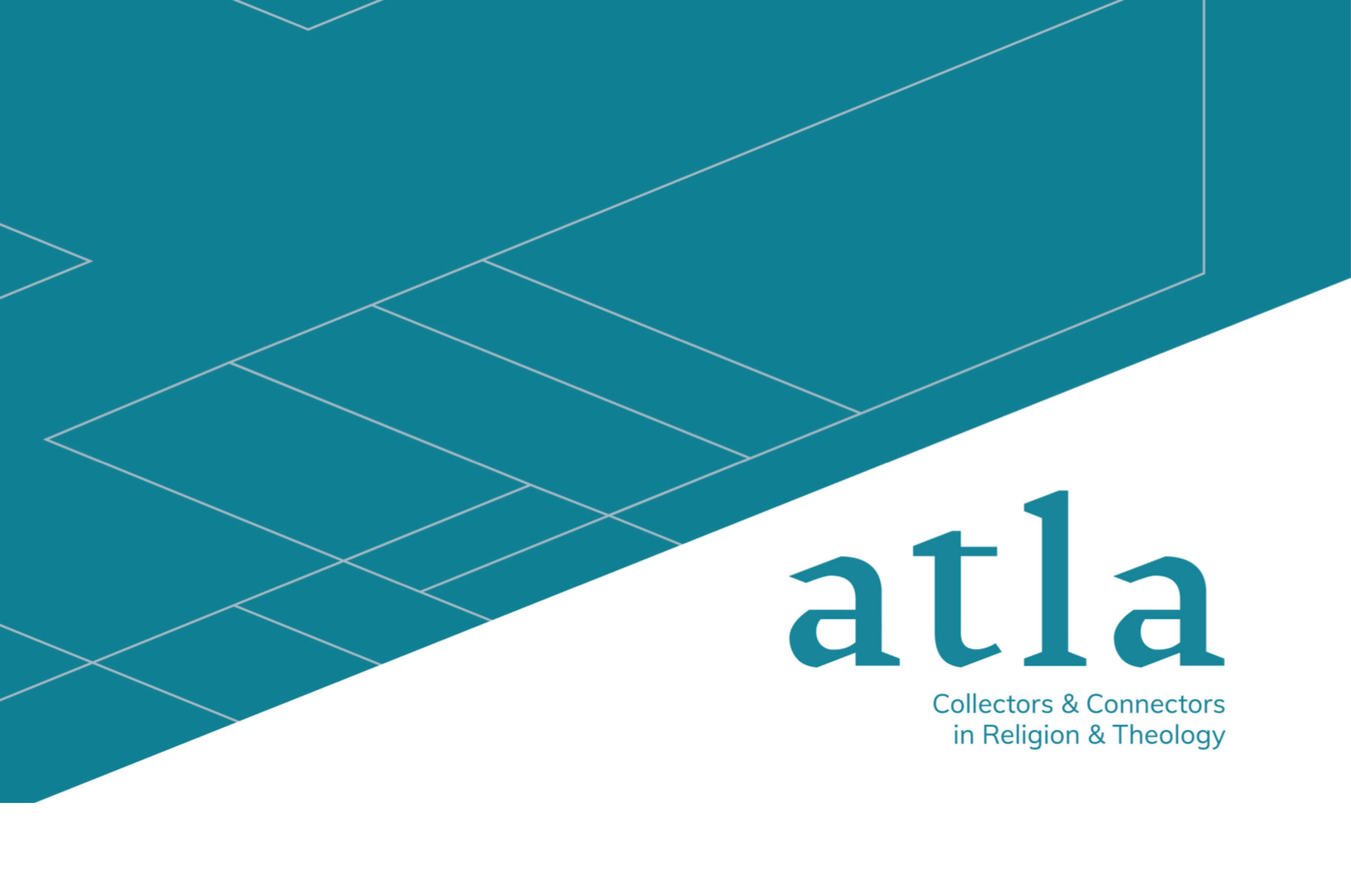
The research directly led to the final core brand promise and is reflected in the tagline, Collectors & Connectors in Religion and Theology. The new tagline is more inclusive and representative of the organization’s diverse audiences and offerings.
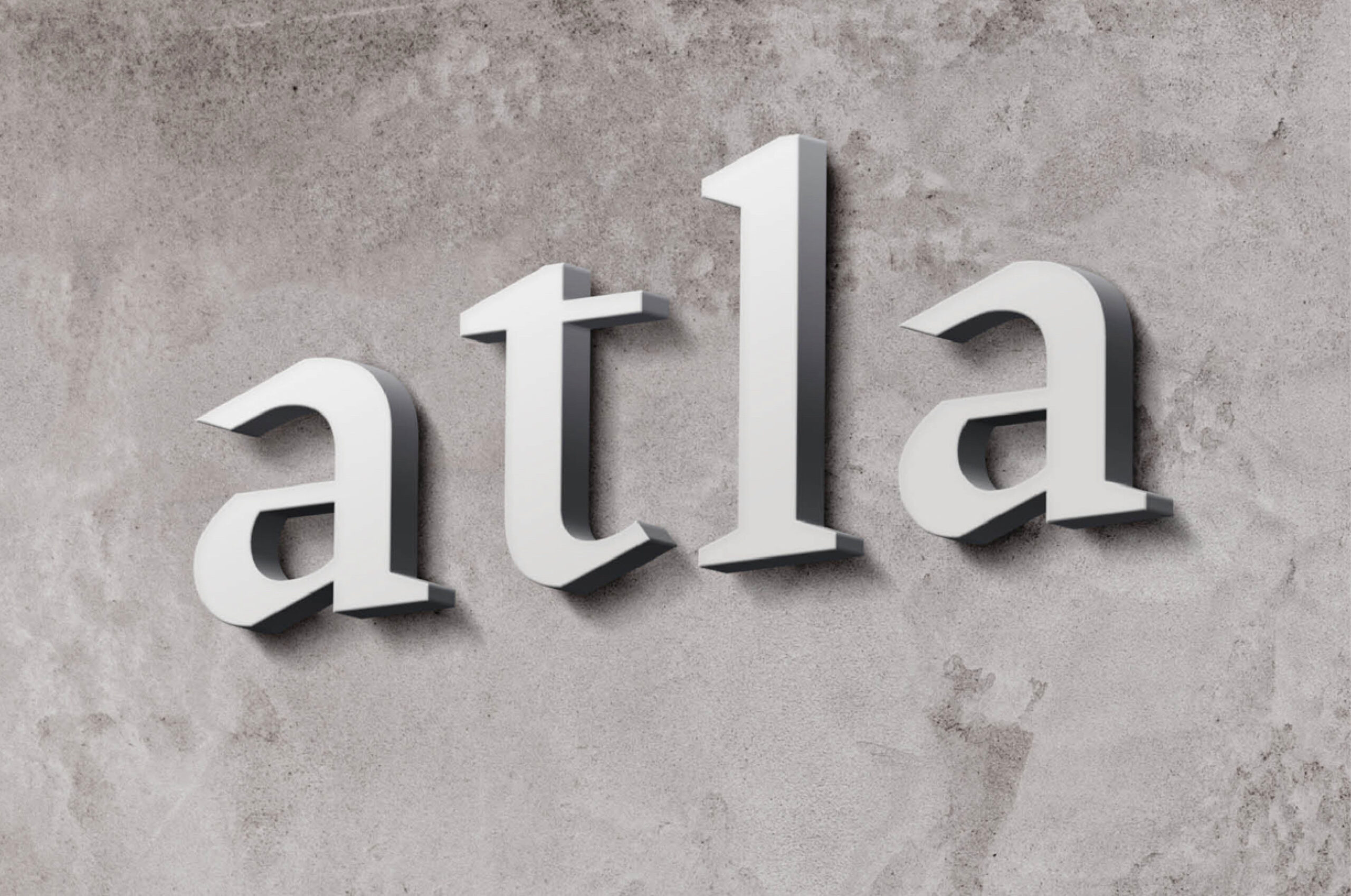
Logo + brand visual system
As a 73-year-old organization, the logo and supporting brand visual system had to embody the rich history of the organization, while also creating a timeless icon that is relevant today and into the future. Their audiences are global and span many religions, so the visual treatment had to work well in this global context.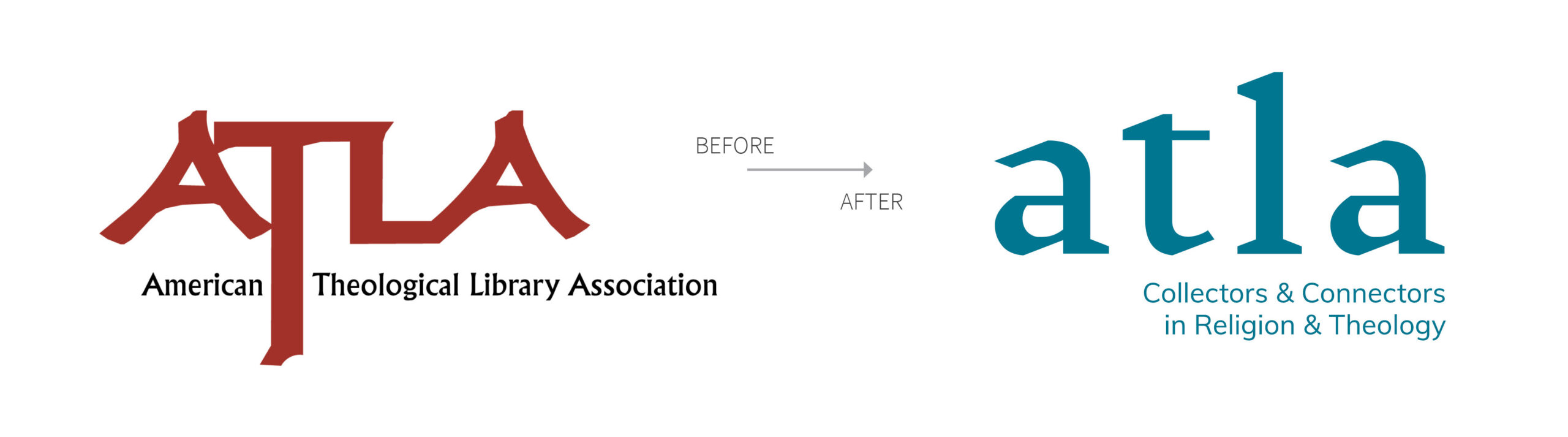
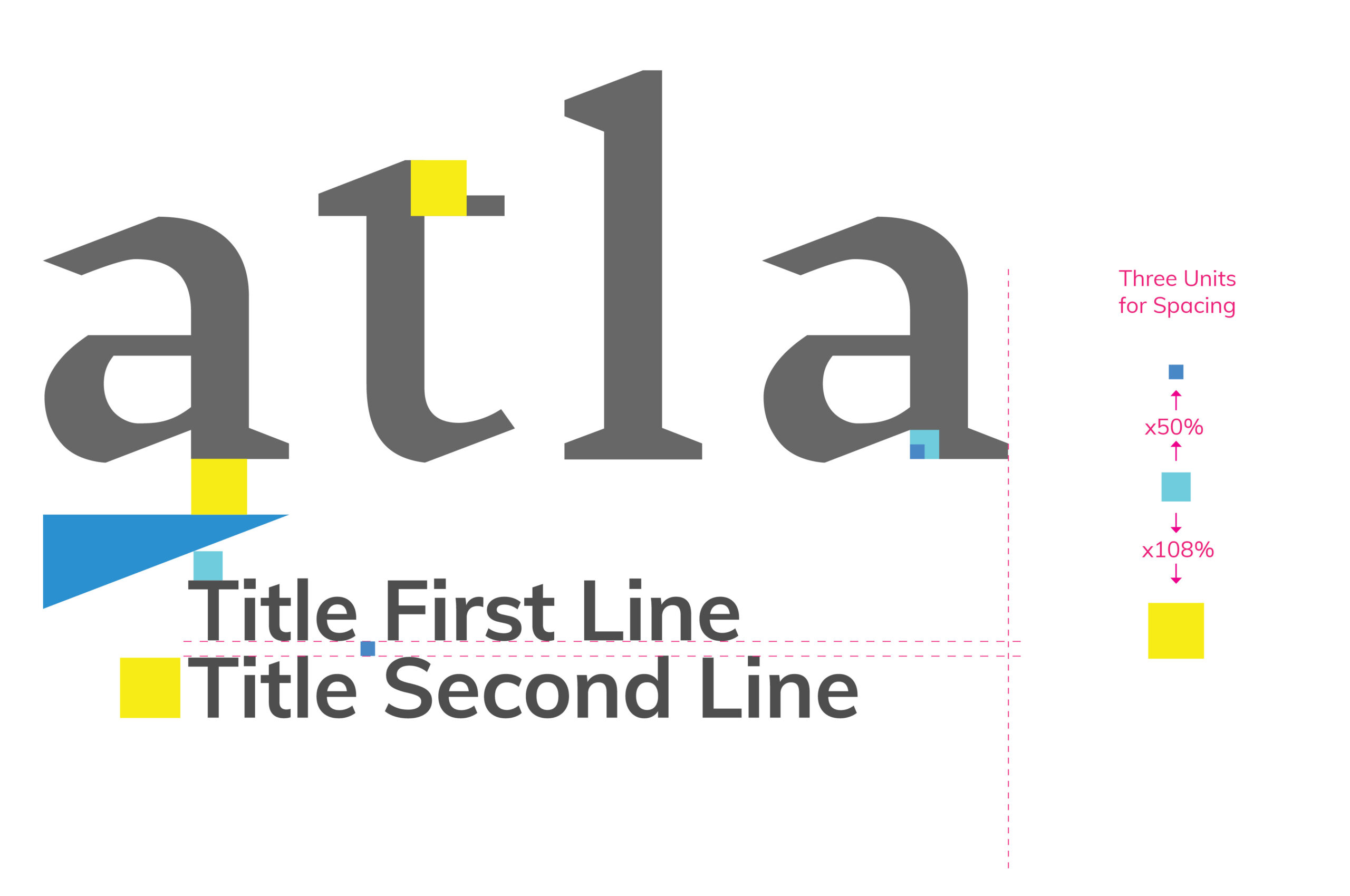
Creating a connection grid and visual representation of Atla’s tagline
The tagline focuses on two core aspects for all of Atla’s work—collecting and connecting. The logo letters are designed with the connection grid, a system of angles, horizontal and vertical lines. The connection grid is used throughout all the brand expressions to nod to these core aspects.
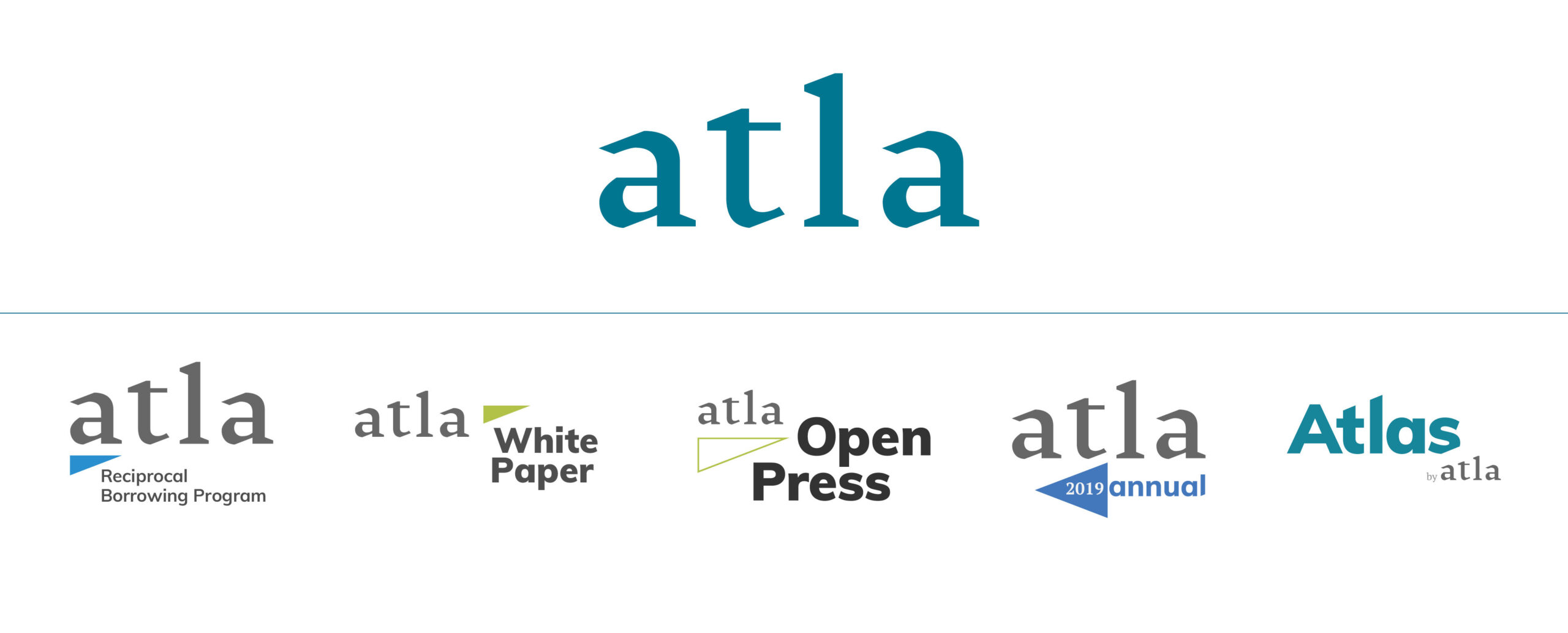
Crafting a scalable, robust brand system
Atla is a thriving organization with diverse and devoted key audiences. They are both a membership organization and a producer of widely-used database products that serve academic libraries and publishers around the world. A common challenge with large organizations with many initiatives is bringing all these initiatives under the new brand visual umbrella while preserving their unique experiences that speak to specific audiences. Our team took a deep dive into all existing brand uses to develop a five-tier brand system that promotes this initiative-level uniqueness and personality, while creating a scalable and consistent visual system. The system design relied on a strong collaboration between our team and the Atla team and shows smart visual design choices that position all initiatives to strategically use the new brand.
Developing brand standards to promote consistency
We prepared a detailed brand standards tool that empowers the Atla team to work with the brand, including guidelines to create brand visuals that work within the system. The connection grid, which is the base for the logo and visual system, and the spacing system is based on a proportional approach, making it easy to size and place the visuals with ease. The document also covers brand messaging and positioning.The brand in action
Here are some examples of the Atla brand and connection grid throughout the brand expressions we created.
Learning from Atla: Rebranding best practices
When engaging in a re-brand, it is important to understand your history and your brand through the lens of your audiences so you can create a smooth transition between the former brand and the updated brand. Atla’s team did this with great precision and made for a very successful brand launch that was more quickly adopted among its audience groups. A few things to assess if you are engaging in a re-brand to ensure the transition is smooth and effective:- What are the most important aspects of your organization to your audiences? These aspects should be your focus as you consider updated narratives and visuals.
- What are you doing well that you want to be known for? Build on these things as you consider your brand strategy.
- What are other organizations doing in your space? By understanding the landscape, you can design an updated brand strategy to position you exactly where you want to be within this space.