Blog Insights
The Ins and Outs of Designing In-Browser
(For a more general background on how the website for Fairfax County Public Schools was designed, please see my previous blog post)
Generally, web designers tend to use static design tools like Adobe Photoshop. These tools produce a fixed, unchanging, non-interactive mockup of what the finished website would ideally look like. This is how it has been for a long, long time.
Alternative tools have popped up over the years, but they all produce the same thing — an approximation of the site. The front-end developer (FED) still has to open the design in whatever program created it, dig through layers, attempt to interpret what the designer intended, and then build the actual, functional site.
Coding a functional, responsive website is very time-consuming and difficult for most web designers. Most designers specialize in the visual vocabulary of the website system, and aren’t as familiar with the nuances of the CSS box model for layout, or the more recent flexbox layout model. Their time is usually better spent focusing on the aesthetics of the interface, rather than fighting bugs, cross-browser compatibility, layout frameworks, and much more.
The Drawbacks to Designing Websites in Photoshop
The traditional approach to website design using static Photoshop comps has its fair share of drawbacks.
It Takes a Long Time to Polish the Finished Site
This process of reviewing finished code, sending changes to a FED, then waiting to see the results to do another round of QA takes up an enormous amount of time in polishing the design. It’s like an expensive game of telephone.
The Front-end Developer Has to Make Too Many Design Decisions
If the designer did not specify things like hover states, active states, focus states, etc., then the FED has to make those design decisions as they go. Static comps don’t typically come with any sort of animations, so the FED has to decide when, if, and how to use animations in the interface.
The Photoshop Comp is Not Code
“Photoshop comps are the most effective way to show your clients what their website will never look like.” – Brad Frost
Photoshop and tools like it are not code. They generate static designs that do not adjust based on screen width. Typically, a designer might create a full width comp, and a separate mobile width comp, but this ignores the many tiny variations that can happen in between those extremes in browser width.
It Can be Difficult to Communicate Complex Interactivity to a Client
When a client sees a static comp, in my experience, they often ask, “What happens if I click there?” or, “How will this look on mobile?” You can show before-and-after comps, of course, but it still requires some abstract thought and there is plenty of room for misunderstanding.
You Don’t Get a Sense of How it Will Feel to Use the Site
Tools like Photoshop can’t show you how it will feel to use the website. What impressions you will get when loading the site on your phone and trying to find the content you need. Will the animation used to open and close a menu become distracting or annoying after the tenth time you click it?
Designing In-Browser, Instead

Early in the FCPS project, I decided that it would be better overall to move into functional, coded prototypes as quickly as possible. But, I didn’t want to write code.
I Hate CSS, Let’s Not Use That
“Why not just write code?” you may ask, especially if you are a front-end developer. I’ll quote designer Bret Victor to explain better:
“The example I like to give is back in the days of Roman numerals, basic multiplication was considered this incredibly technical concept that only official mathematicians could handle. … But then once Arabic numerals came around, you could actually do arithmetic on paper, and we found that 7-year-olds can understand multiplication.
It’s not that multiplication itself was difficult. It was just that the representation of numbers — the interface — was wrong.”
– Bret Victor, Former Interface Designer at Apple
And now, I’ll quote myself.
“I hate CSS.”
– Daniel Ferro, Senior Interaction Designer at Forum One
Basically, CSS, the primary means by which you create visual design in websites, is incredibly frustrating for a designer to work with. As a designer, I simply want to draw a box, nudge it around, apply some colors to it, etc. I want to design a website visually, with fast, intuitive tools that give me immediate feedback.
I don’t want to lose half of my working day trying to figure out why my footer is overlapping the content above it. I want to design. Sure there are lots of multi-talented “unicorns” out there who can code as fast and as well as a FED, with a decade or more of experience. But I am not one of those unicorns.
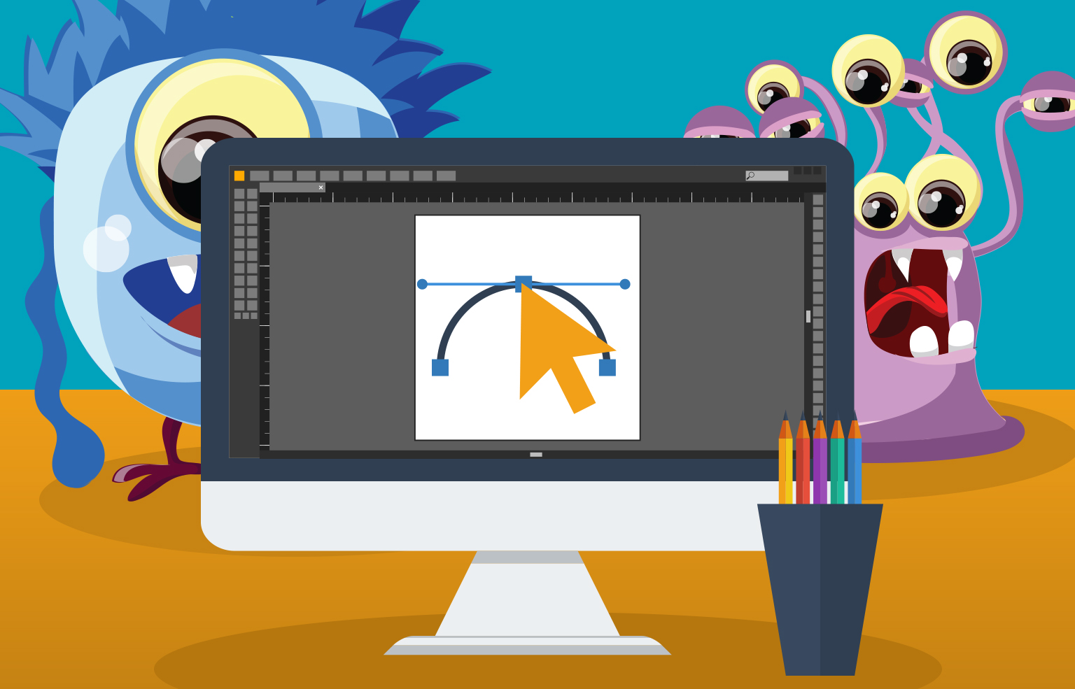
The Right Tool for the Job: Webflow

I have tried numerous tools that promised to eliminate the need to code when creating an interactive design. But out of all of them, only one truly seemed to work as advertised: Webflow.
Webflow is an in-browser design tool that allows you to create functional websites without having to code any CSS. This freed me to focus on the design and interactivity, and not on wrangling code.
“No other design discipline still uses text-based abstractions to create its visual products.“
– Vlad Magdalin, Webflow CEO
I was able to take an initial loose design – the approved concept direction – and create a functional design. Instead of presenting a static photoshop comp to FCPS, we showed a page that they could play with and interact with on their own laptops and phones.
I found Webflow was easy to work with. Initially, I created the FCPS designs using the standard CSS box model for layout. But then, quickly after I finished, Webflow released the first visual flexbox builder.
I went back and changed my layout to take advantage of the flexbox model instead, which I found to be far more intuitive and easier to work with. Finally, building a functional site and taking advantage of what modern CSS has to offer was no longer frustrating.
We created secondary page elements using a hybrid page, which we then recreated in Pattern Lab. The Pattern Lab code then found its way into the finished Drupal 8 site.
Here is an example of one FCPS landing page we designed inside webflow, and another example here of a detail page.
Lessons Learned: The Pros
There were a number of great benefits to taking the in-browser approach.
Happy Front-end Developers
Our FED in this project, Corey Lafferty, told me working with webflow prototypes instead of Photoshop files was much easier for him. He said it felt they communicated more than the static comps did, and using Webflow cut down on overall time for him.
Happy Clients
We were able to more efficiently and quickly communicate our ideas for interactivity to FCPS, since we were showing them functional code that they could manipulate in their own browsers, and on their own phones.
Modular Design Was Easier
Combining the Webflow prototype with our standard Pattern Lab process worked wonders. Since we embrace modular design at Forum One, the design focuses a lot on reusable components that scale well across devices and pages.
I was able to literally copy and paste a component into other pages that required it, and immediately see if the component would indeed work universally (for instance, a button) or if it needed some tweaking.
My general philosophy when it comes to web design is do not create a new variation of a component unless absolutely necessary, and this tool allowed me to better judge when it was truly necessary to deviate from an established component design.
Overall Higher Quality
The overall effect was higher quality. Instead of the “death by a thousand papercuts” that can plague other projects when nuanced aspects of the original visual design get lost as they’re translated into code for the final website, we were able to polish and communicate every small detail to the front-end developer earlier in the process. I was able to take charge of every small design decision, such as exactly how hover effects would work on links, down to the timing of the animation.
I was able to find places where the design was problematic, for instance, as it scaled to narrower and narrower browser widths, and adjust the design as necessary.
Lessons Learned: The Cons
Designing Directly In-Browser can Take a Long Time, Even with Webflow
While Webflow does an amazing job of allowing designers to quickly and intuitively create functional websites, it takes too long to design everything directly inside Webflow.
The design process requires a lot of experimentation. Maybe I want a header to be here, or there. Maybe I want a heading to overlap this photo over here a little bit, or I want a diagonal overlay there. In a static tool like Photoshop, testing out these experimental ideas is very fast.
In Webflow, it takes much longer. I need to create nested Div inside nested Div, give them classes, margins, etc. While Webflow itself advocates eliminating the static tools altogether and doing everything inside Webflow, I found that each time I wanted to experiment it took much longer than it would to do it directly in Photoshop.
However, this only applies to the heavy involved initial design work. I have found that more basic internal pages are much faster to design inside webflow than photoshop. So your mileage may vary.
“Designers: Add up all the time you took complaining about Photoshop/Sketch, and you could’ve just learned to code.”
I hear the viewpoint reflected in the above quote a lot, but I feel it’s a bit misguided. In general, when the FED community is baffled by why designers don’t just design in code, this stems for a lack of understanding or appreciation of the process visual designers use to arrive at the comp they ultimately deliver to the FED.
Sure, once I arrive at a design decision in a static design tool, creating the functional prototype is fairly fast. But the design decisions have already been made. I only need to make the comp functional. It can be easy to underestimate the time and technique involved in getting to that point when all you ever see is the finished design.
No Data Tables in Webflow
At the time of this writing, Webflow did not offer data tables. I had to emulate tables using Divs instead.
No Very Wide Breakpoints Available in Webflow
Webflow’s widest breakpoint is set at a little over 990 pixels. This is a bit limiting since ideally I might want to load different font sizes, margins, and more on very wide browser widths, such as those approaching 3000 pixels or more.
Forms are Limited in Webflow
Webflow does not make it very easy to create custom functional radio buttons, or checkboxes, or complex form validations. It offers a fairly basic functional form elements at least, but if you want to skin them you’re going to have to probably just emulate them and hand them off to the FED to work their magic.
My Overall Conclusion on Designing In-Browser

Webflow is going to be part of my process going forward. But sadly, despite my own issues with Adobe programs (in a nutshell, I feel they have ambitiously bad user interfaces and user experiences) and a willingness, even desire to abandon them entirely in favor of Webflow, I need to keep both around.
The process I will be using from now on is arriving at my design choices in Photoshop, using it as a sort of a sketch pad, then moving as quickly as possible to a functional prototype in Webflow.
Yes! Do It! Just Don’t Code It
Coding a good responsive website is difficult. Visually designing a good website is also difficult. Attempting to multitask and do both, in my opinion, will invariably result in the dilution of both. If you are a visual designer, keep concentrating on visual design.
Check out Webflow. It is free to use, you can play with it and explore the plethora of tutorials. You need to pay to unlock multiple pages and other advanced features, but the free account gives you access to all the same tools you’d use to build a page. No other tool available right now is even close to as good for allowing a visual designer to build functional websites themselves without coding, especially regarding flexbox.
“CSS is easy. It’s like riding a bike, which is on fire and the ground is on fire and everything is on fire because it is hell.”
Reach Your Design Decisions in a Static Tool First
Whatever your weapon of choice, be it Sketch, Illustrator, InDesign, Photoshop, Fireworks, etc., use that first to arrive at your overall concepts. Then take those ideas and put them into Webflow.
As I went into detail earlier, it just takes too long to go through the raw design process in a tool meant to create functional websites. While Webflow is much faster than hand coding, in my opinion, even that is still too slow for designing a website from scratch.
Use Real Content As Much as Possible
Avoid relying too much on Lorem Ipsum, or just copy pasting the exact same content over and over. Using real content, or at least realistic content will help stress test your design. Maybe that H1 you were in love with does not work so well with realistic use cases of headings in your client’s website.