Blog Insights
The Power of Data Visualization to Close the Hunger Gap
CAFB uses its Hunger Heat Map to better understand the unmet need for food in neighborhoods in their service area and to target resources better to serve key needs. The Heat Map data visualization is changing lives by putting more food into the hands of the families who need it most.
And it all started as a humble internal experiment.
Earlier this week, Forum One hosted a webinar with CAFB to talk about the data work they started to explore in 2015, and how it has culminated in the Hunger Heat Map used today.
As the largest organization in the Washington, DC area working to solve hunger, CAFB works with 400+ partner organizations to serve more than 500,000 people. The approach they took in developing the map, and the lessons they learned, hold a lot of value for nonprofits that deliver social services. Here are some insights from our discussion.
In 2015, the Food Bank wanted to better understand where the greatest needs were for food in its area, including how need was changing in low-income pockets in suburban areas. CAFB took on an internal pilot project to try to visualize the hunger situation. How they approached it:
- They first pulled together and “cleaned up” internal CAFB data sets, as well as datasets from partners such as Feeding America, the US Census Department, and other sources.
- They then put the data into ESRI’s ArcGIS tool to create “heat maps” using different colors to visualize (1) where hunger was most prevalent, and (2) where food services programs were not reaching those in need.
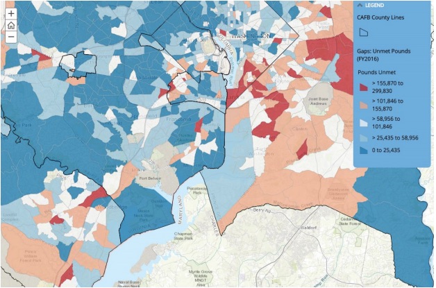
With the Heat Map up and running, CAFB saw that there were pockets of unmet need within Wards 7 and 8 in Washington DC, and that in suburban areas, such as along the Route 1 corridor in Virginia, there was unmet food needs combined with a lack of public transportation and a lack of social services for food. Because of this data, they have expanded their programs and partnerships to those and other areas. For example, since 2015:
- In partnership with Martha’s Table, Joyful Food Markets has provided more than 1.2 million pounds of food to 70,000 people, and will be serving up to 39 elementary schools by fall 2017
- In partnership with Shoppers Food Warehouse, Mobile Summer Meals has delivered 9,200 meals to children!
How much did this cost them? This first version of the Hunger Heat Map cost the CAFB a few hundreds of dollars of software licenses to develop, but it took a lot of effort to collect and clean up the data. The total staff time for this first version was about six months of a half-time staff person. They now do data updates about twice a year, which take around one week of staff time.
What are some of the biggest insights I came away with from our discussion with CAFB?
- Get your data on! Compile the data you have (and can get your hands on) about your target issue, clean it up and get it into a common data warehouse. This can be a lot of work – but is a necessary first step in shifting to being a more data-driven organization. Get started on it now!
- Pilot, experiment, iterate. CAFB did not envision when it started what the Hunger Heat Map would look like nor how vital it would become to their program planning. They learned this by taking it on as a pilot, learning, iterating, adjusting, and expanding!
With such positive feedback and results stemming from the Hunger Heat Map, the CAFB continues to evolve and expand its maps — all of which are available for public use online. Take a look today!
Resources:
