Blog • Insights
Delight in Unexpected Places
I was happy to contribute to A List Apart’s article ‘Back to the Future in 2016,’ which asked various web and technology experts about what they intend to focus on in 2016. I thought I’d expand a bit on the idea of what I want to focus on as a web designer in 2016 as summer rapidly approaches.
Don’t Forget Users Like to Smile
I feel there is a bit of a flaw in the UX industry. So much of the focus relies simply on getting a user from point A to point B—about designing only what a user needs—that we forget that designing what a user doesn’t need can be just as important.
In a typical UX document, joy and whimsy are usually nowhere to be found. It’s like we forgot that the X in UX stands for “experience.” What’s wrong with adding a little bit of delight? It takes nothing away from the functionality of the website or application. In fact, it’s what differentiates a merely functional tool from one that’s fun to use.
Essentially, what will make someone’s visit to your website even better than a merely useful experience is a delightful experience.
That’s what I really want to focus on for the rest of 2016: delight in unexpected places. I want the subtle animation when a user clicks on a button, or hovers over a photo, or does something as simple as highlighting text to copy it, to delight the user. I want the simplest of interactions to bring a smile.
Some Examples
Here are a few examples of how I think you can add a little bit of fun into your interface.
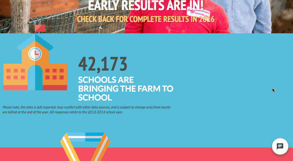
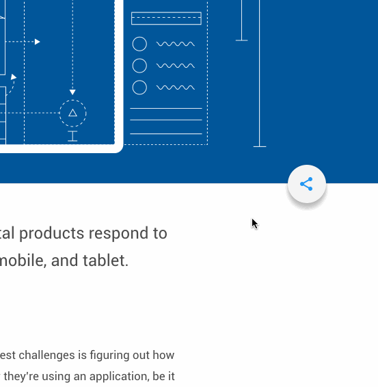
Farm to School Census: Floating Action Button
Take a look at the subtle social sharing floating action button (FAB) I implemented into the Farm to School 2015 Census website. I found inspiration from Google Material design—my reasoning being that Google is currently leading the way in web and interaction design and will probably continue to do so throughout 2016.
Sparkbox: More Footer Button
Sparkbox did a great job of building in little bits of delight into their footer. Scrolling to the bottom of their site brings a little surprise and a smile when the user clicks on the “More Footer?” button.
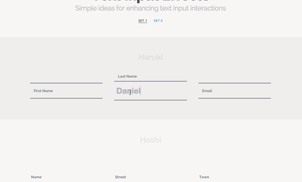
Tympanus: Text Input Effects
This collection of form input effects is a great example of how you can make something as mundane as filling out a form just a bit more fun.
Beyond Prison: Blockquote Animation
This longform web documentary on the prison system in the United States has ambitious amounts of whimsy all over the site. Delightful details abound in simple things like how blockquotes animate into the page as you scroll, or in how the page borders angle in as you scroll.
Google Resizer: Sharing Button Animation
Google built a nice, simple and fun animation into their FAB on their Resizer page to encourage social sharing.
These are just a few prime examples showcasing the delightful results of focusing on the X—the “experience”—in UX. If you need any advice on how to add more fun to your UX design strategy, feel free to contact us today!