Blog • Insights
Four Decades of Design
We are celebrating with the Communications Network on their 40th anniversary. The Communications Network is a valuable organization that provides a place to collaborate and innovate across the communications space — sharing ideas, evidence, and lessons about how smart communications improve lives.
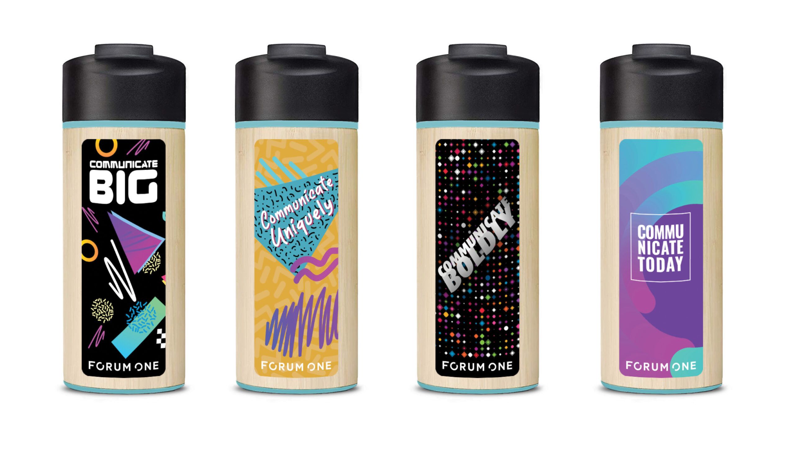
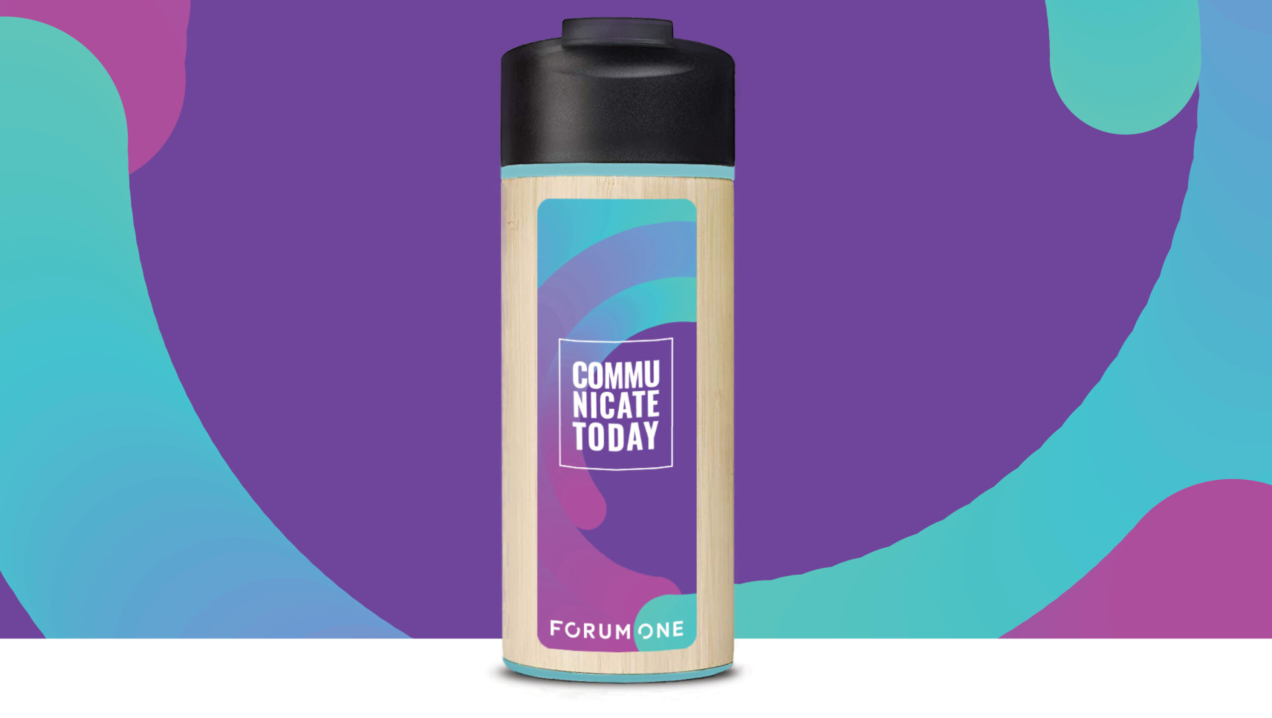
Our team is helping the Communications Network celebrate four decades of ground-breaking communications leadership through custom artwork for the anniversary water bottle, provided to each attendee at the ComNet19 conference this week in Austin, Texas. There’s a bottle representing each decade — inspired by the most iconic visual communications styles from each decade, with a key message that seeks to encapsulate the communications expression of that decade. Which one would you choose?
 Curious what inspired each bottle? Hop in my design Delorian, as we swim through the sea of neon, dodge slap bracelets, gag on hairspray fumes, and skid across the metallic surface of the millennium—it’s 40 years of communicating through visual design.
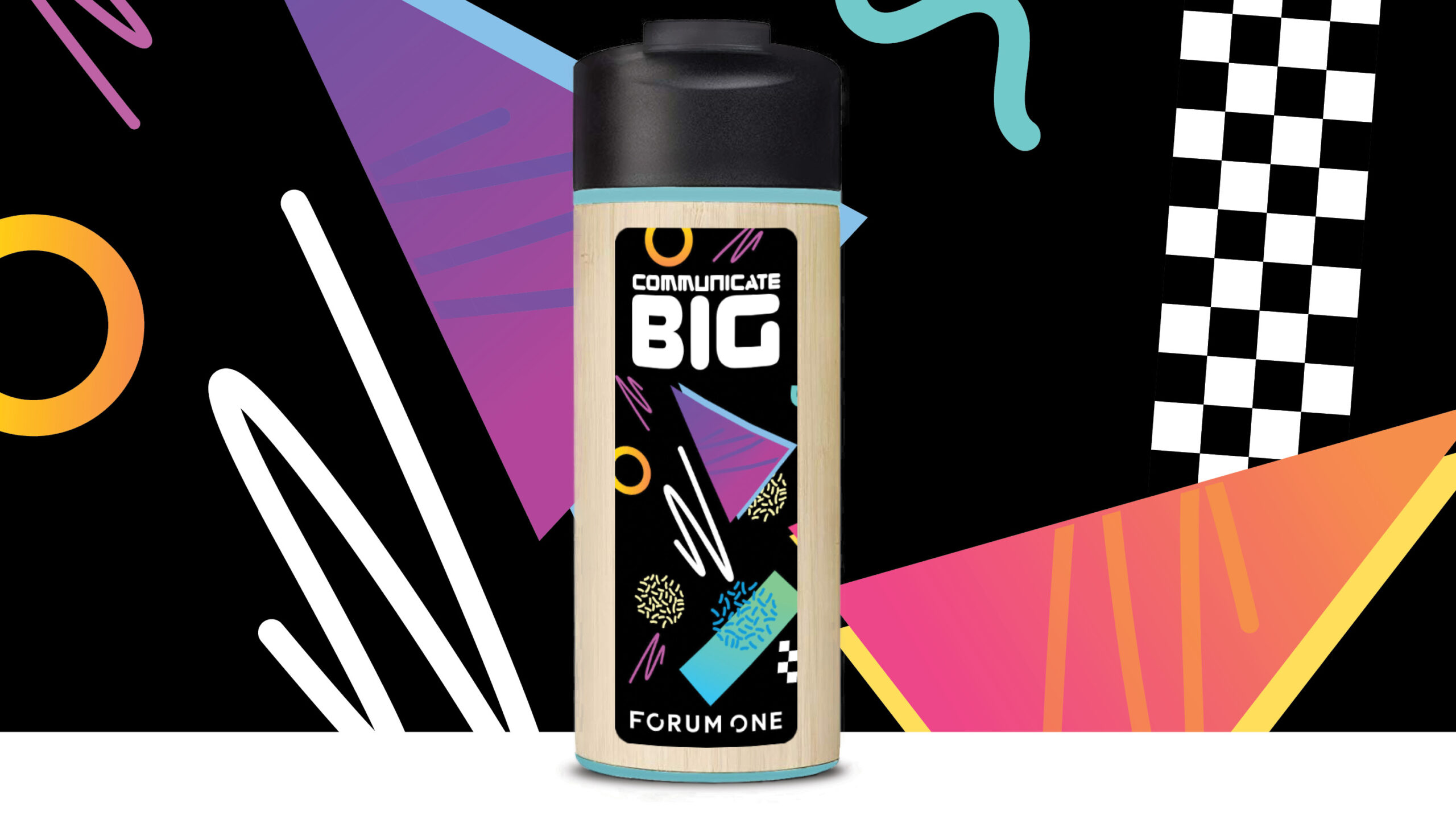 Wow, the 80s. Either you lived through this decade of excess and opulence, or you have channeled your inner 80s at at a themed event. Try to look through the cloud of hairspray to see what inspired the 1980s bottle.
 The 1980s propelled color into our faces in a big way, exhibiting what it looks like to visually communicate in excess. Colors were loud, primary and in abundance—just remember the iconic Apple rainbow logo and energetic and lively clothes. The key message for the 1980s bottle, Communicate Big, captures this approach to this opulent visual style that is seared in our brains.
 The 80s grew up and birthed the 90s—a seemingly refined version of itself (but was it really that refined?!) Put down that Game Boy and see what iconic styles inspired the 1990s bottle.
 (Don’t miss a young JC Chasez as an MMC cast member before NSYNC was a thing)
The 1990s saw a noteworthy muting in color, which was an intentional departure from the previous few decades of vibrancy. Music and culture seemed to reject the materialism of the 80s by celebrating individuality over conformity and consumerism, which inspired the key message of the 1990s bottle, Communicate Uniquely.
(Don’t miss a young JC Chasez as an MMC cast member before NSYNC was a thing)
The 1990s saw a noteworthy muting in color, which was an intentional departure from the previous few decades of vibrancy. Music and culture seemed to reject the materialism of the 80s by celebrating individuality over conformity and consumerism, which inspired the key message of the 1990s bottle, Communicate Uniquely.
 The future never looked so fresh. We partied like it was 1999, then dodged total digital meltdown as we emerged into a new century full of metallic sheen and futuristic colors. Turn up your Backstreet Boys CD as you take in the smooth and fresh styles that inspired the 2000s bottle (spoiler alert, Britney and Justin aren’t a thing anymore).
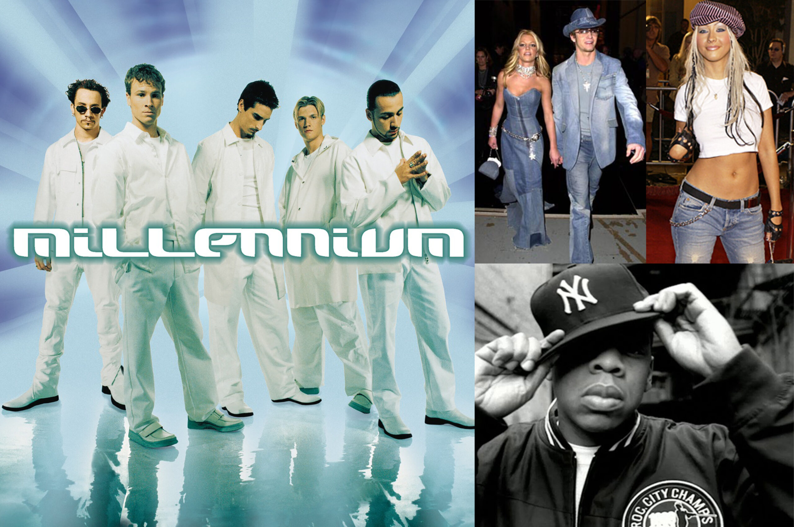
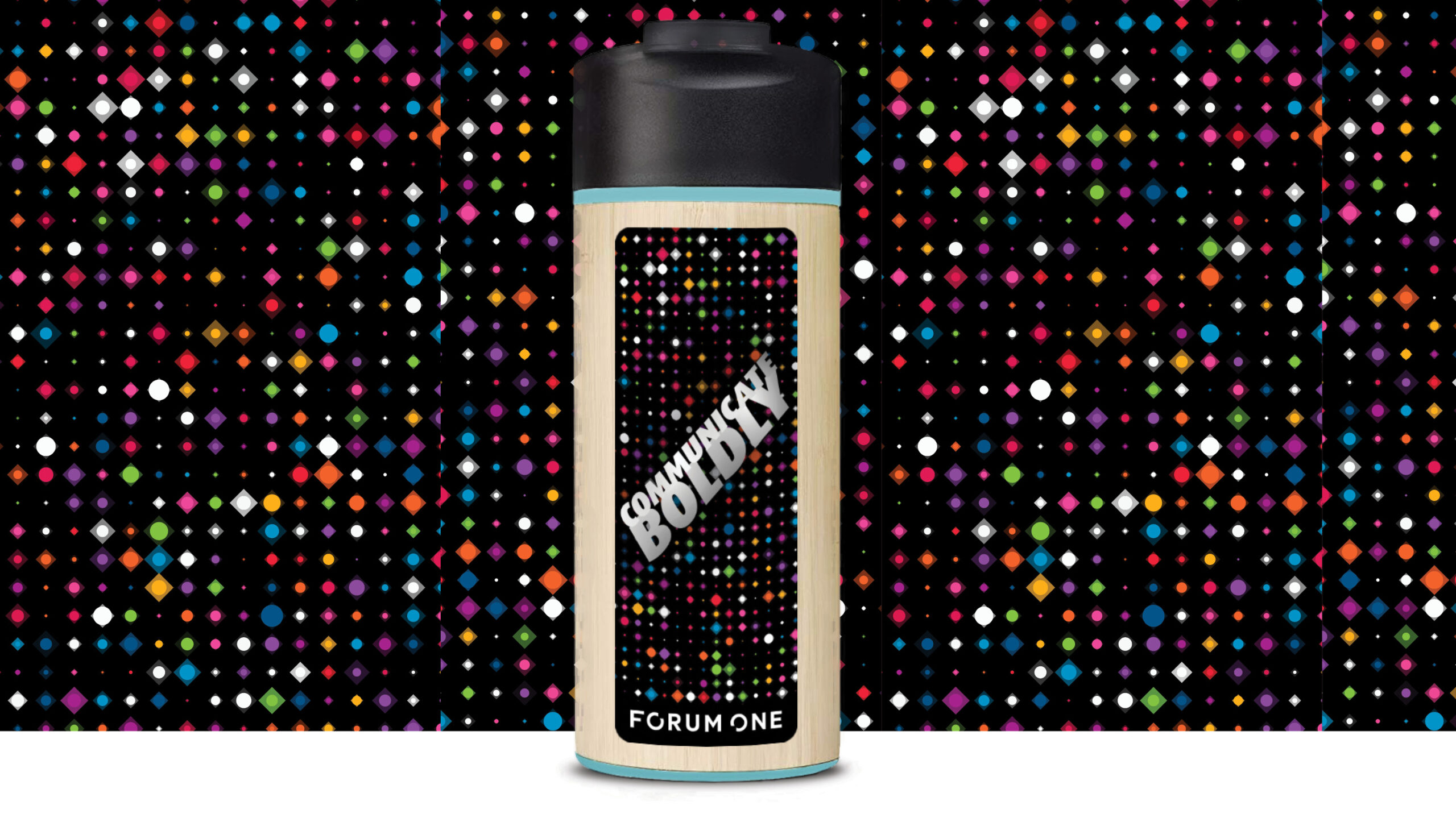
 The 2000s saw celebrity culture and technology drive the narrative for visual communication, with music and reality stars defining the style and color tones for the world. Metallic and monochromatic was an anchor color theme, supported by bold candy-colored swatches that appeared on tech gadgets, on our screens, and on our favorite (or not-so-favorite) celebrity obsessions. This visual decadence on a global scale inspired the 2000s bottle key message to Communicate Boldly.
As we face the ending of another decade, we capture the NOW in a way that doesn’t feel dated (yet). Make sure you are sitting down to see what inspired the 2010s bottle, as you may find yourself saying “What? That was almost 10 years ago??”
 The 2010s have embraced minimalism in a big way, with strategic and intentional use of color and rustic wood and metallic tones and gradients. What’s being dubbed as “millennial pink” has been a defining color of the decade, along with shades of purple and rose gold, made popular by Apple in their iPhone color launched in 2015. As we look to emerging trends of the next decade, the key message for the 2010s bottle is appropriately Communicate NOW.
Curious what inspired each bottle? Hop in my design Delorian, as we swim through the sea of neon, dodge slap bracelets, gag on hairspray fumes, and skid across the metallic surface of the millennium—it’s 40 years of communicating through visual design.
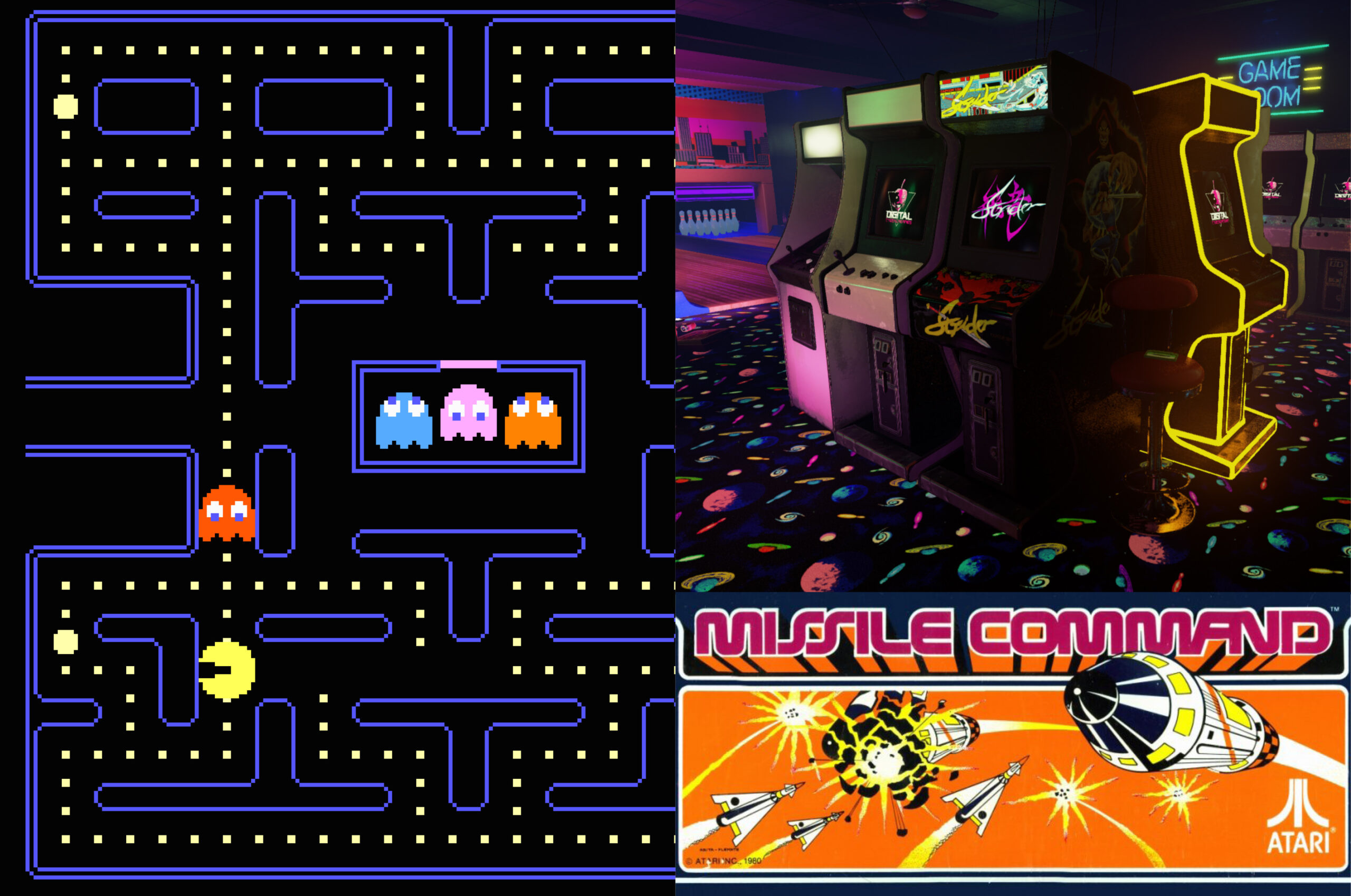
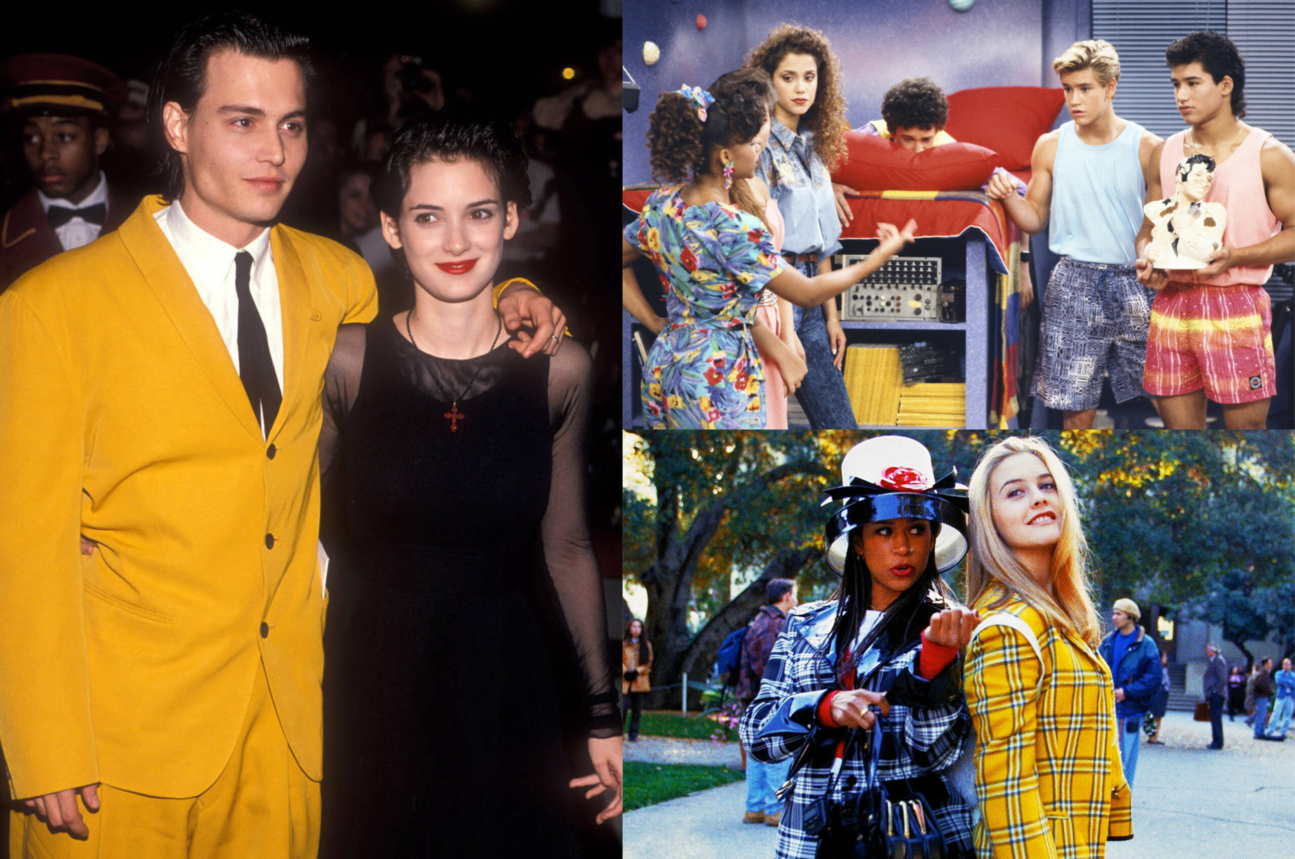
1980s: Communicate Big
Wow, the 80s. Either you lived through this decade of excess and opulence, or you have channeled your inner 80s at at a themed event. Try to look through the cloud of hairspray to see what inspired the 1980s bottle.
Neon ruled
Movies were big and other worldly
Video games rocked in 8-bit COLOR
Pink (and purple) was pretty… much everywhere
The 1980s propelled color into our faces in a big way, exhibiting what it looks like to visually communicate in excess. Colors were loud, primary and in abundance—just remember the iconic Apple rainbow logo and energetic and lively clothes. The key message for the 1980s bottle, Communicate Big, captures this approach to this opulent visual style that is seared in our brains.
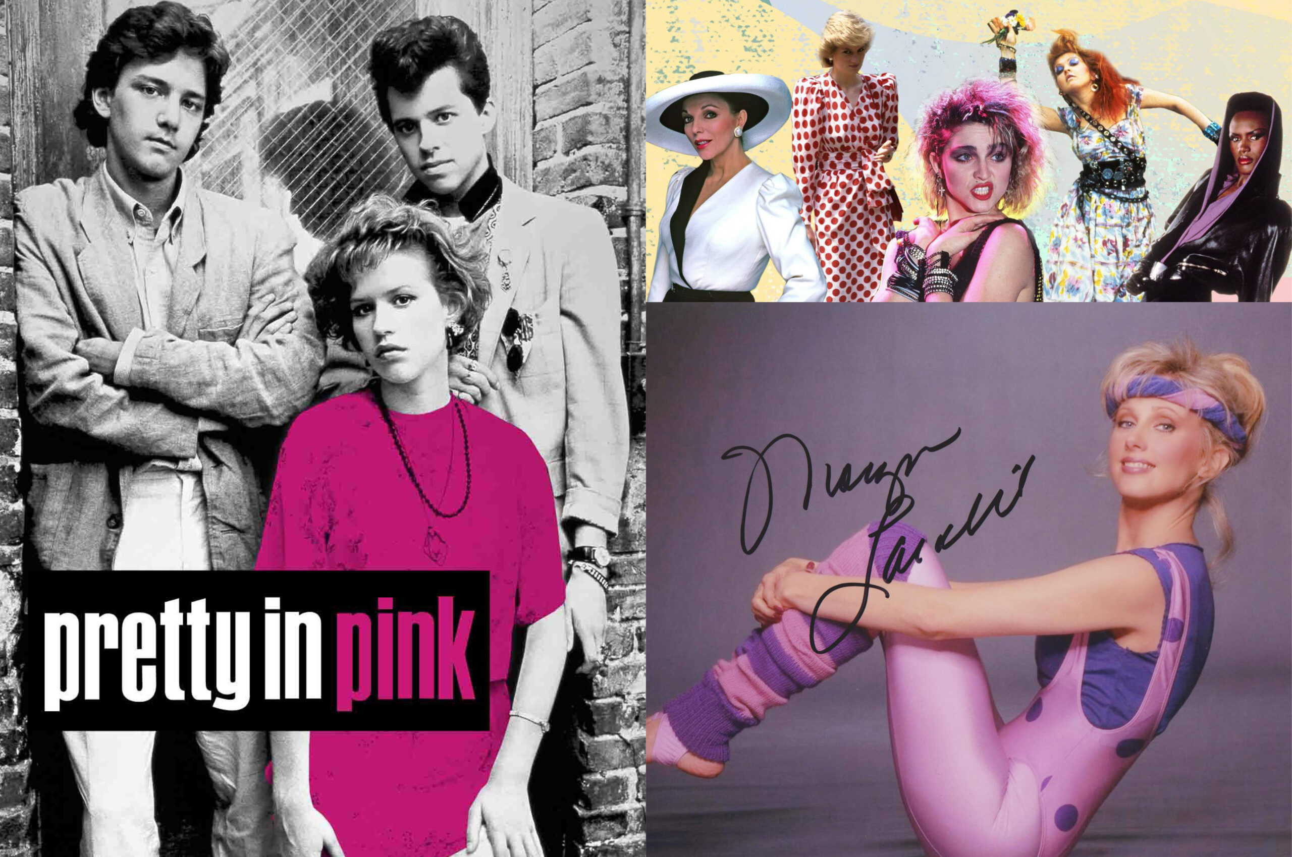
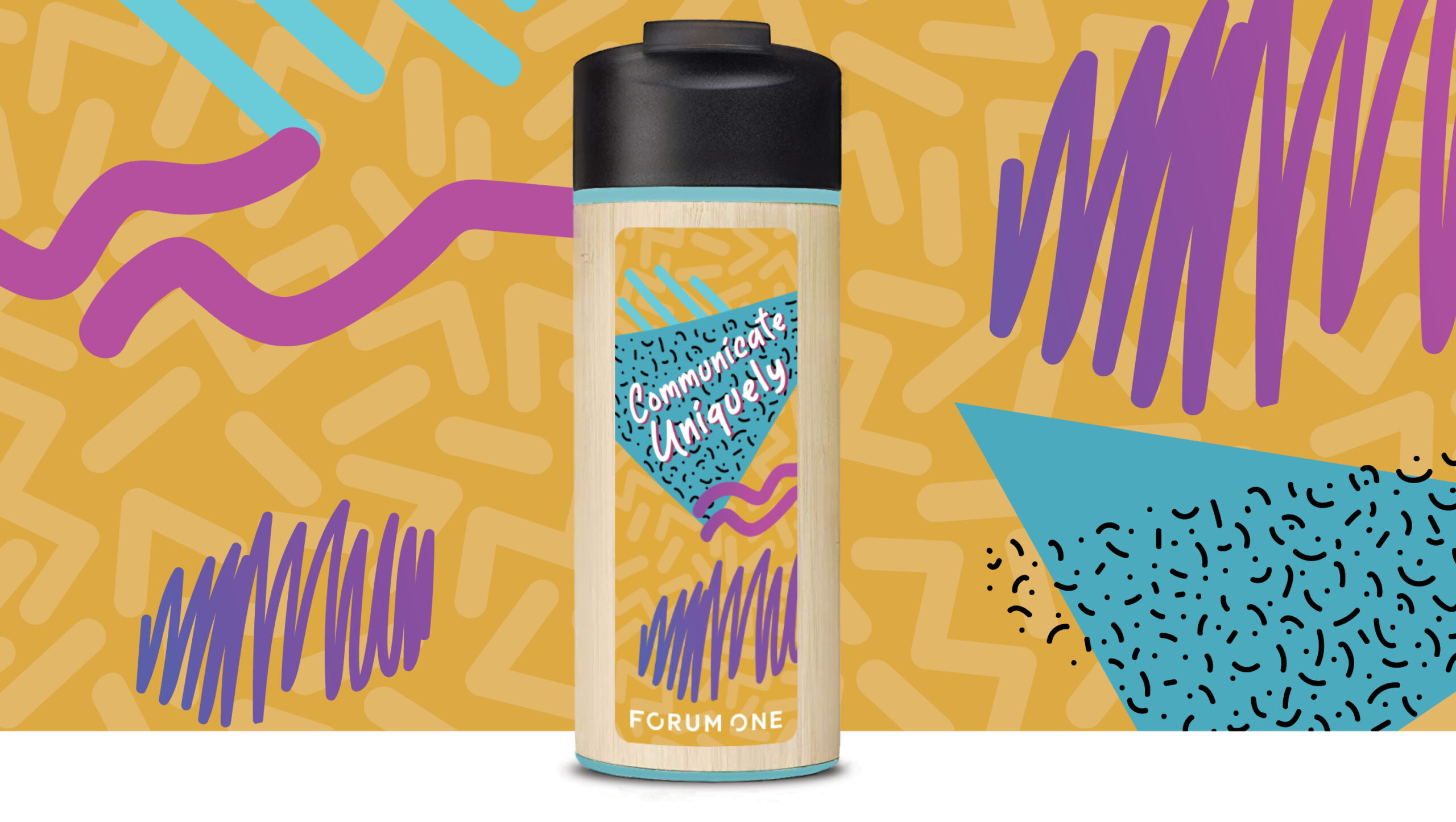
1990s: Communicate Uniquely
The 80s grew up and birthed the 90s—a seemingly refined version of itself (but was it really that refined?!) Put down that Game Boy and see what iconic styles inspired the 1990s bottle.
TV was full of character
Fashion was muted (at least compared to the 80s)
Opening credits had unique personality
(Don’t miss a young JC Chasez as an MMC cast member before NSYNC was a thing)
The 1990s saw a noteworthy muting in color, which was an intentional departure from the previous few decades of vibrancy. Music and culture seemed to reject the materialism of the 80s by celebrating individuality over conformity and consumerism, which inspired the key message of the 1990s bottle, Communicate Uniquely.
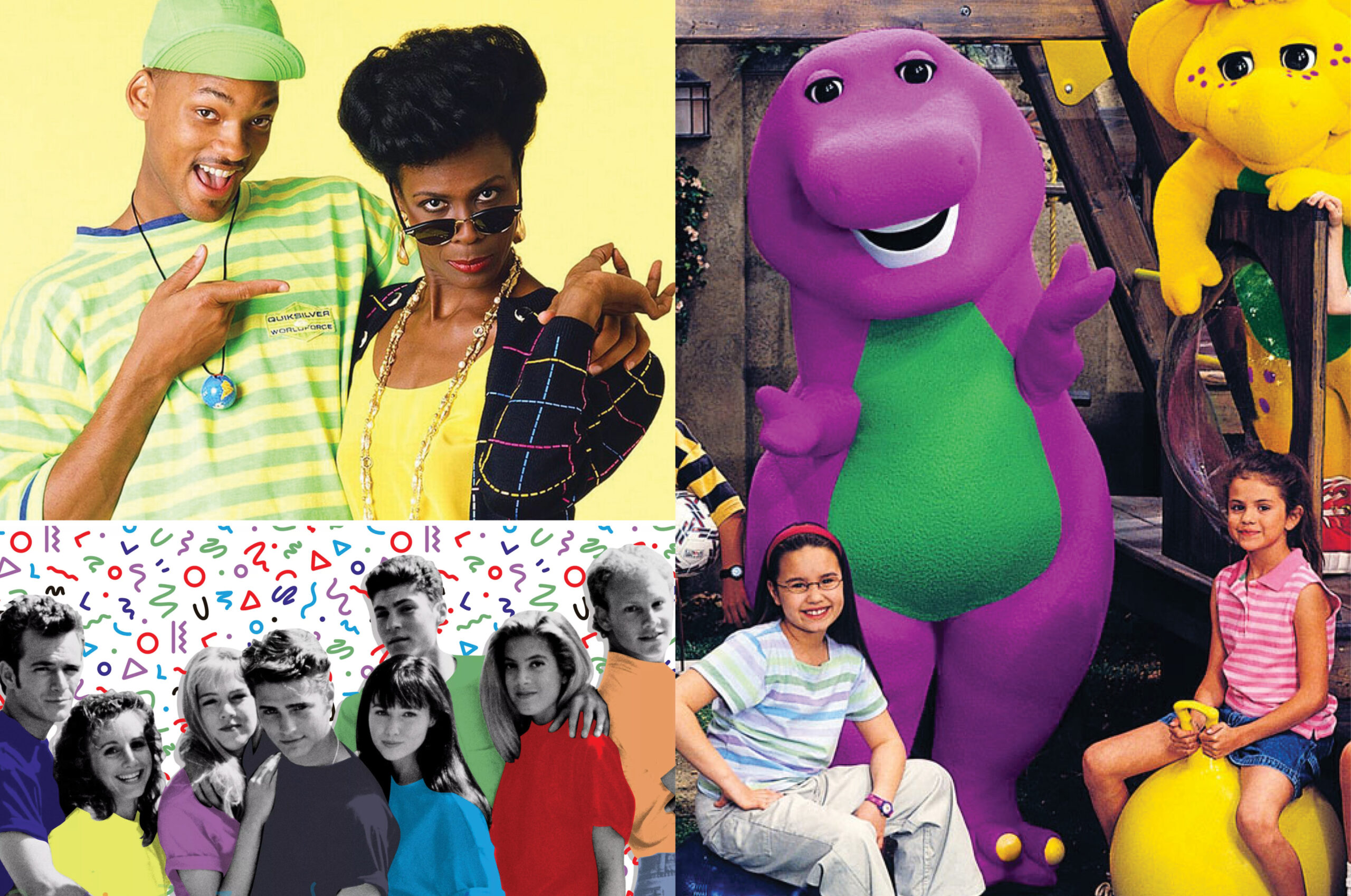
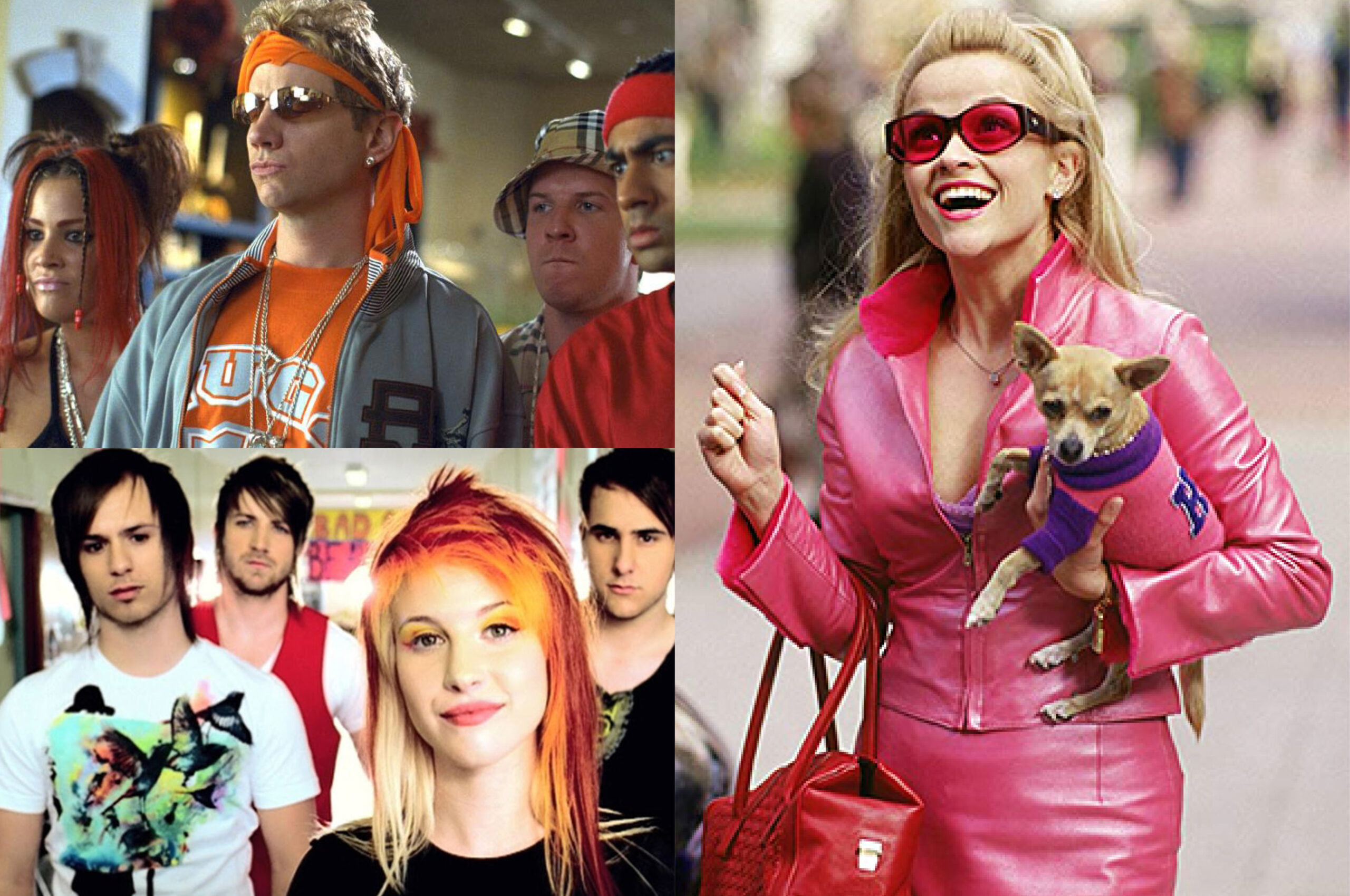
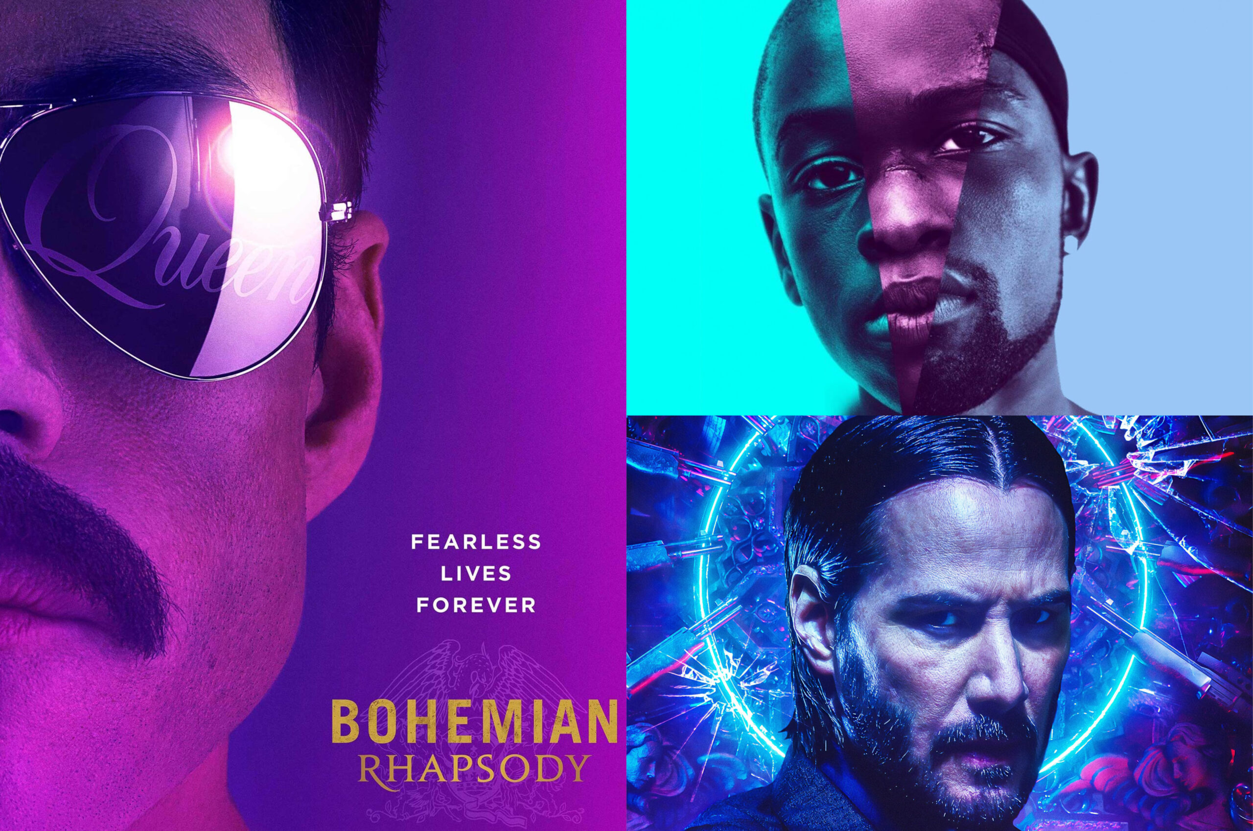
2000s: Communicate Boldly
The future never looked so fresh. We partied like it was 1999, then dodged total digital meltdown as we emerged into a new century full of metallic sheen and futuristic colors. Turn up your Backstreet Boys CD as you take in the smooth and fresh styles that inspired the 2000s bottle (spoiler alert, Britney and Justin aren’t a thing anymore).
Music reverbed with millennium force
Style was minimal and bold
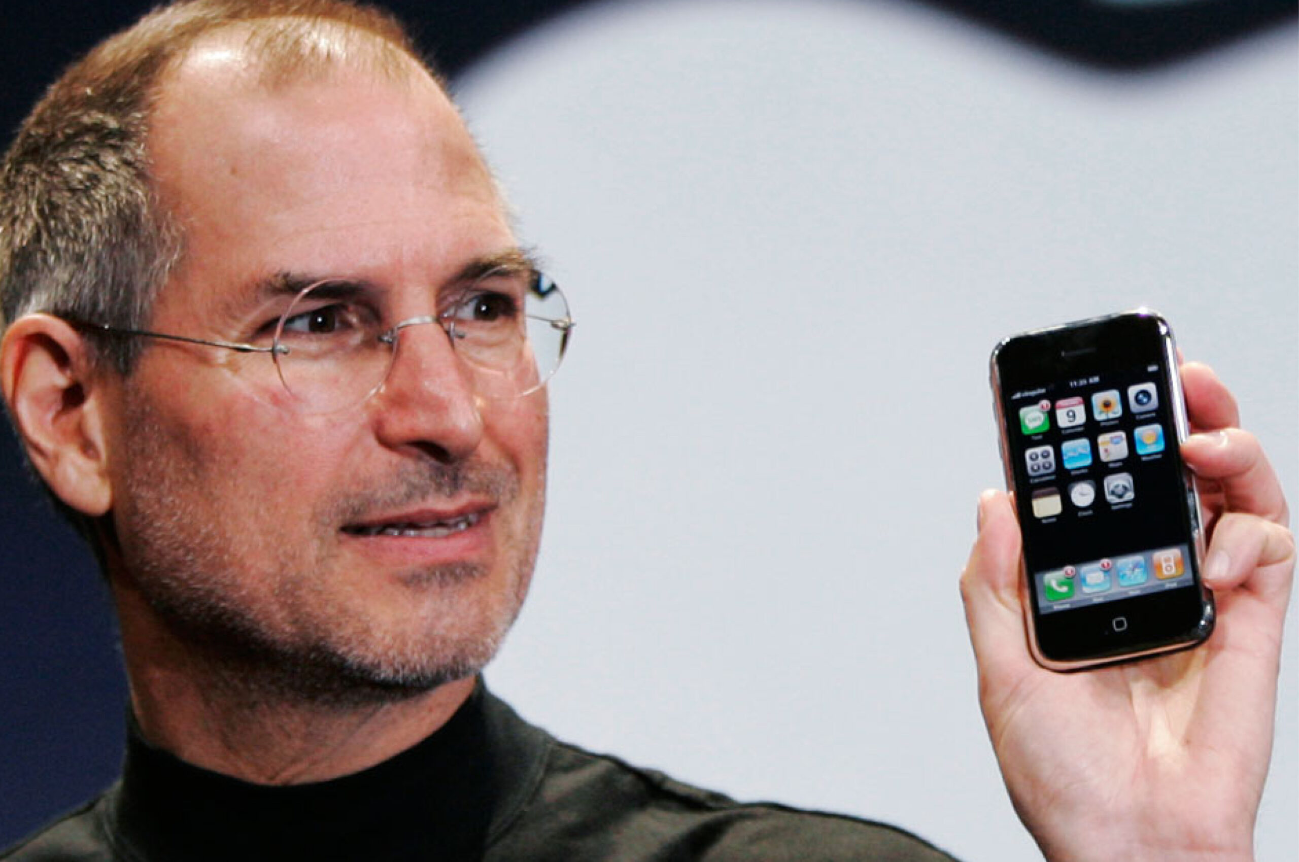
Tech skeu….ed to make the future look and feel real
The 2000s saw celebrity culture and technology drive the narrative for visual communication, with music and reality stars defining the style and color tones for the world. Metallic and monochromatic was an anchor color theme, supported by bold candy-colored swatches that appeared on tech gadgets, on our screens, and on our favorite (or not-so-favorite) celebrity obsessions. This visual decadence on a global scale inspired the 2000s bottle key message to Communicate Boldly.
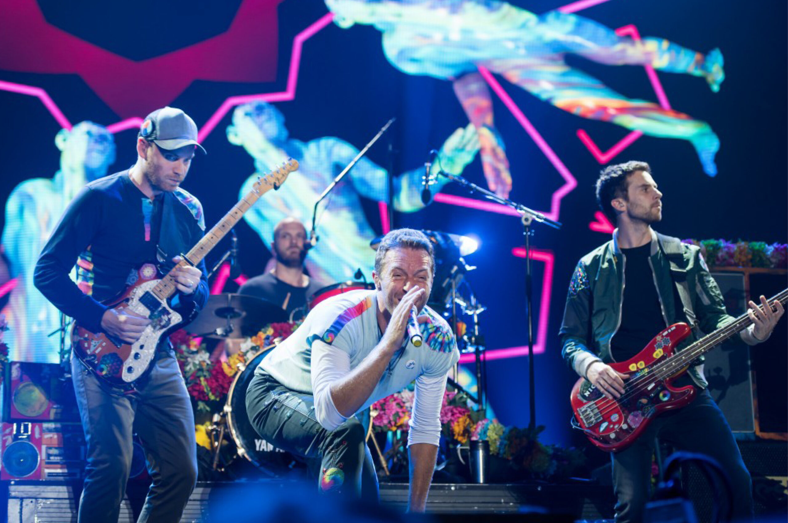
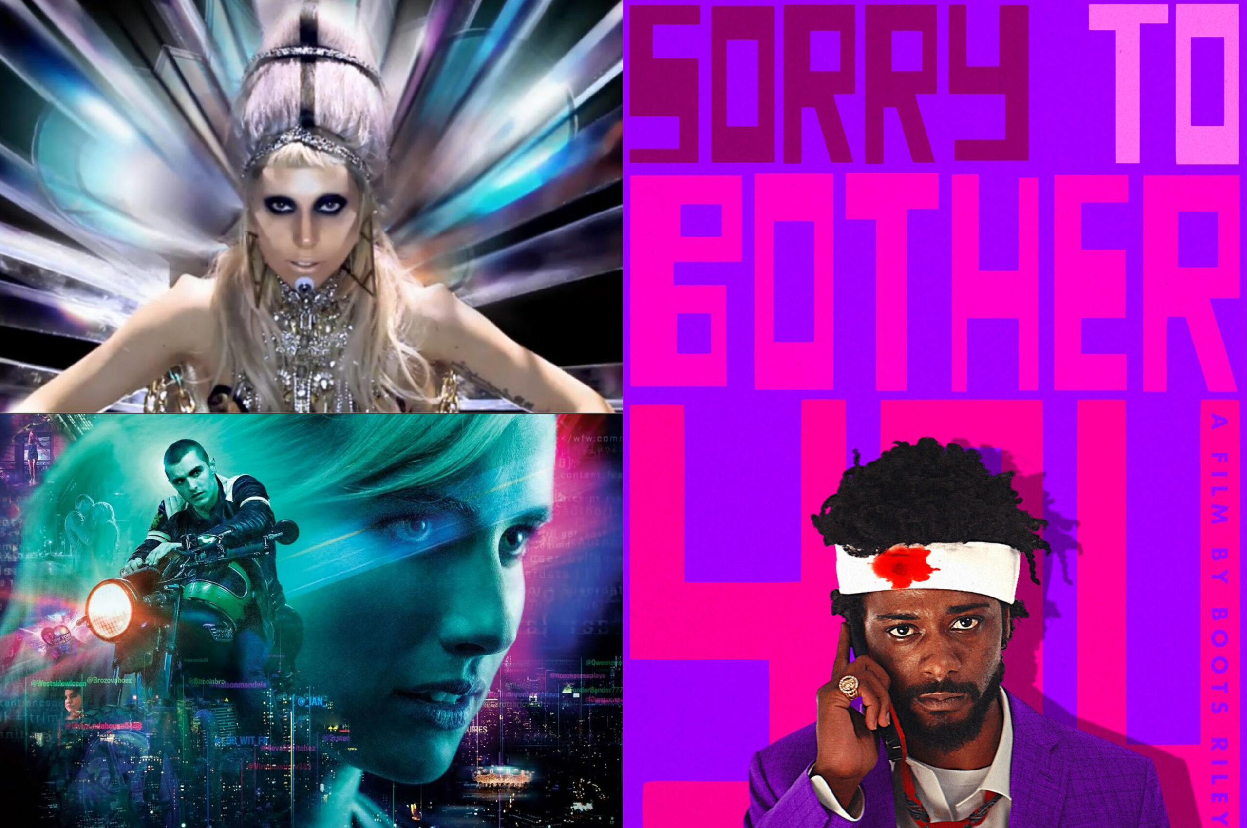
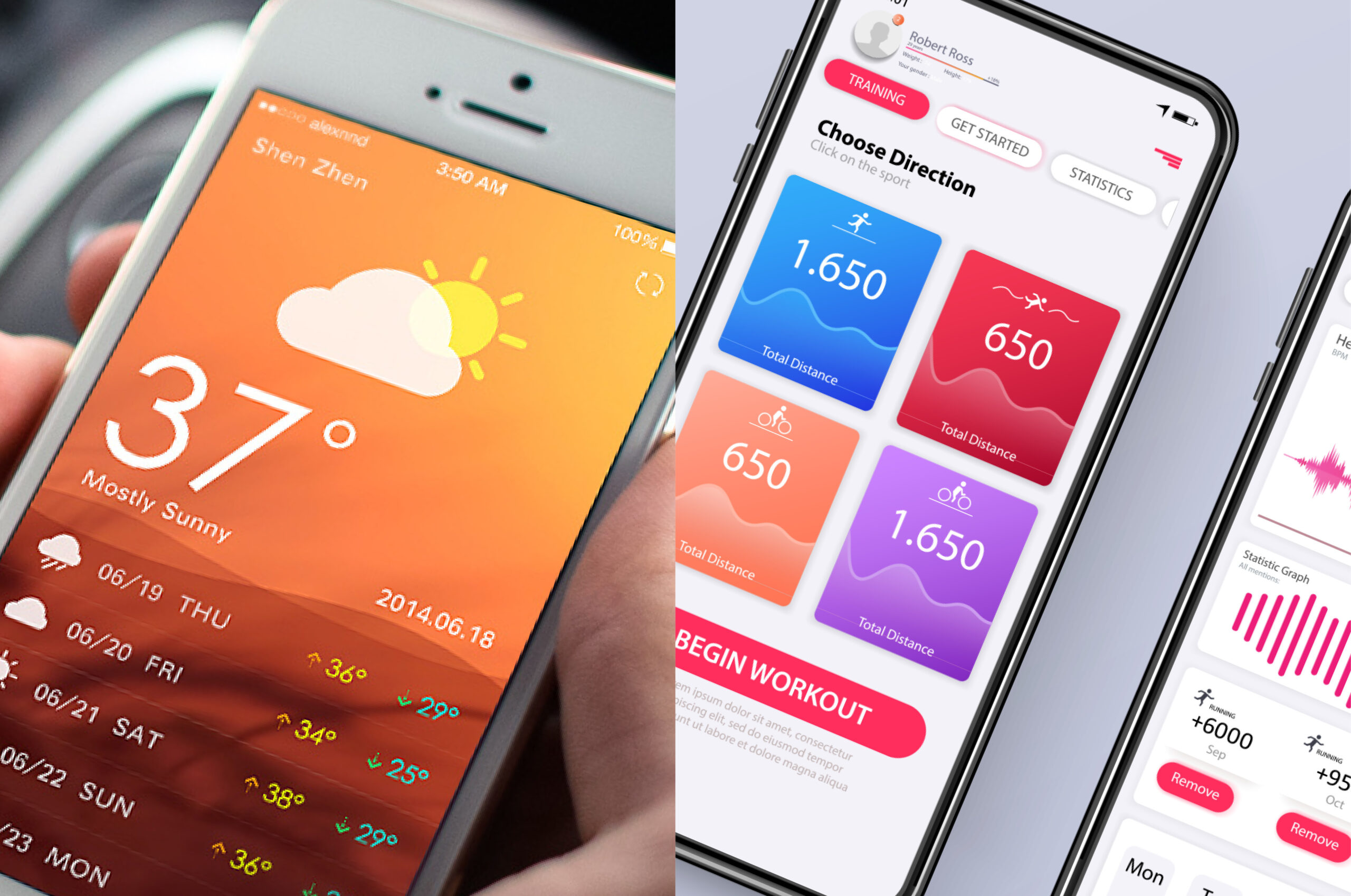
2010s: Communicate NOW
Music in gradient color
Surreal worlds fill our screens
Color moods are clear and intentional
Tech flattens
The 2010s have embraced minimalism in a big way, with strategic and intentional use of color and rustic wood and metallic tones and gradients. What’s being dubbed as “millennial pink” has been a defining color of the decade, along with shades of purple and rose gold, made popular by Apple in their iPhone color launched in 2015. As we look to emerging trends of the next decade, the key message for the 2010s bottle is appropriately Communicate NOW.
What’s to learn from this journey back in time?
Communication is most effective when it uses color, style, and tone to speak to people in a familiar way. The success of the above examples focused on really capturing people with a sense of intentional style, and they represent definitive visual communication styles that really made an impact. Though we don’t recommend channeling the 1980s for your next fundraising campaign or website refresh, there may be a time and place to subtly nod to a vintage style.Also: stay tuned to this week’s upcoming Forum One blogs as we look back on the last four decades of communications more broadly. Here is Communications in the 1980s to start.