Blog • Insights
Website Breadcrumbs 101
Breadcrumbs are a navigational page element that helps users know their location within a website. A bit like wayfinding signs, breadcrumbs are typically a list of links showing all the pages preceding the current page. But the question isn’t so much “what are they?” but rather “do we need them?”
Breadcrumbs are pretty common and have been part of website UI for decades. Below is an example of a breadcrumb on a public health program site. As web designers, there is always a point during the design process where someone asks the question, “are we doing breadcrumbs?” This then kicks off the following questions: “Should we use them?” ”How do they work?” and, “Where in the design do they go?” And without fail, someone will ask: “Do we even need breadcrumbs anymore? Aren’t they outdated?”
Short answer: Yes, you need breadcrumbs. No, they are not outdated. In this post, we’ll walk through when you should use breadcrumbs and how you should design and implement them.
As web designers, there is always a point during the design process where someone asks the question, “are we doing breadcrumbs?” This then kicks off the following questions: “Should we use them?” ”How do they work?” and, “Where in the design do they go?” And without fail, someone will ask: “Do we even need breadcrumbs anymore? Aren’t they outdated?”
Short answer: Yes, you need breadcrumbs. No, they are not outdated. In this post, we’ll walk through when you should use breadcrumbs and how you should design and implement them.
1. Your website needs breadcrumbs when it is 3 or more levels deep.
If your website looks more like the 3-level site map below, then you need breadcrumbs. This is a sitemap with 2 levels. This is a site map with 3 levels.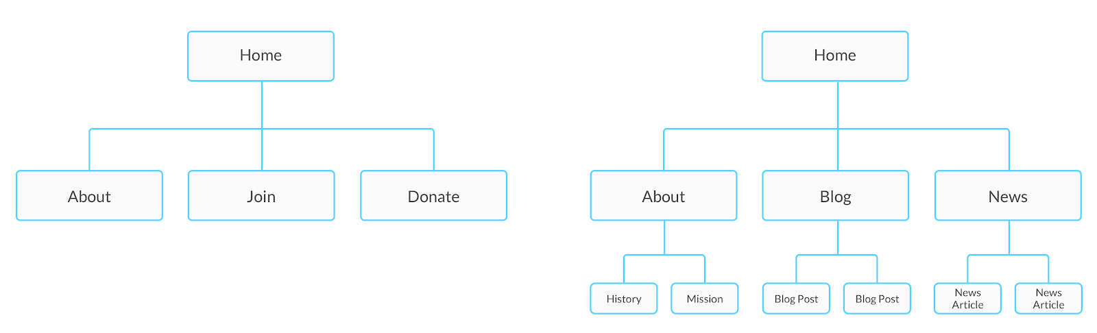 Breadcrumbs have two main navigational purposes:
- They help users understand where they are on the site. Giving users a mental model of the site will help them understand the underlying hierarchy and allow them to move through the site more easily.
- They provide quick navigation. For example, a user opens a blog post from a newsletter, reads it, then clicks on “Blog” from the breadcrumbs to see all the blog posts. Breadcrumbs certainly don’t replace the main menu, but when your site has more than 2 levels, it’s helpful to have an easy way to go up a level.
2. Your website needs breadcrumbs on all screen sizes.
Often, breadcrumbs are included on the desktop version of a site, but are then removed on the mobile version due to smaller screen space. As screens get smaller, people tend to throw UI elements, such as breadcrumbs, out the window. However, breadcrumbs are even more important on mobile. Since the menu isn’t exposed, breadcrumbs can offer wayfinding help for a user. To address the limited space issue, we recommend a single link to the parent page. In the example below, a user lands on a specific IDEO case study, but they may wish to see all of IDEO’s work. A breadcrumb linking to the parent page allows them to navigate to all of them quickly.
3. Your website needs breadcrumbs that are easy to scan and digest
Some webpages have really long page titles, such as news articles or blog posts. The issue with long page titles for breadcrumbs is that they can take up a lot of visual space and possibly wrap to two lines, which can distract users from the real content of the page. While we recommend shorter page titles, sometimes longer page titles are inevitable. Here are some ideas for sites that have lengthy titles:- Don’t include the current page title in the breadcrumb. Pacific Northwest National Labs doesn’t include the current page titles in its breadcrumbs because of long titles. For example, here’s the breadcrumb for the Secure & Adaptive Systems research page:
 Bonus breadcrumb idea: If you take the route of leaving out the current page, try nodding to its existence by including a “>” or “/” at the end of the trail.
- Instead of having the full breadcrumb trail visible, just use the parent page (like the above IDEO example).
- Consider using alternative names for previous pages to help reduce length and redundancy. Below is an example of an optimized breadcrumb trail:
- First click: Home > Leadership Resources
- Second click: Home > Resources > Publications on Emotional Intelligence
- Third click: Home > Resources > Publications > What makes a Leader?
4. Your website needs breadcrumbs that behave correctly
Parent pages in the breadcrumb trail should be clickable; however, the current page should not be linked. There should be some sort of visual indication to show what is clickable and what is not clickable, e.g., underlined parent pages. Bonus breadcrumb content: Certain pages don’t need breadcrumbs, such as the homepage or a landing page because they are only a level or two deep into the site.5. Your website needs breadcrumbs that are well designed
Greater-than arrows ( >) or dashes (/) are commonly used to show progression and movement to separate page titles in breadcrumbs. Users should primarily use the menu to navigate, not the breadcrumbs, which is why they must be distinct. The example below does a good job of making sure the breadcrumb is not taking visual weight away from the main menu, while also having a distinction between parent pages and current pages. Bonus breadcrumb content: Place breadcrumbs near or directly above the page title. User testing shows that breadcrumbs placed near the title are used more frequently than those placed in a different location.
Summary
Breadcrumbs continue to offer value, even if they may sometimes feel a bit outdated. When designing with breadcrumbs, keep the above recommendations in mind. Here’s a snapshot list of them that you can copy/paste and take with you:- Use breadcrumbs when your site is three or more levels deep
- For mobile, consider using a single breadcrumb back to the parent page
- Avoid long breadcrumbs by using shorter names for previous pages
- Make sure to link all parent pages in the breadcrumb trail
- Place breadcrumbs near the page title and use “>” or “/” between pages
- And remember: breadcrumbs are not a substitute for a menu!