NYU Langone Health, Department of Population Health
Translating Public Health Data for Communities Nationwide
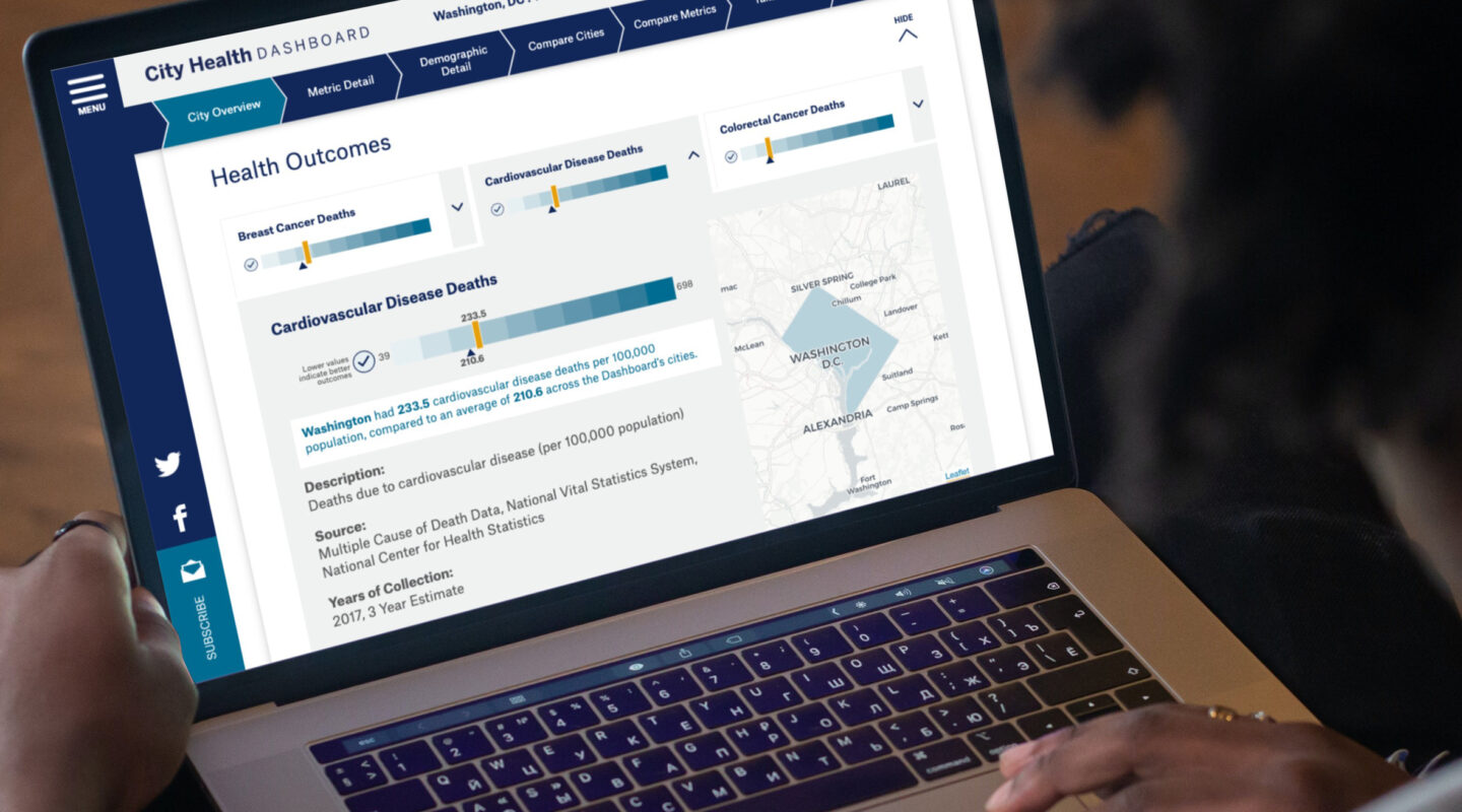
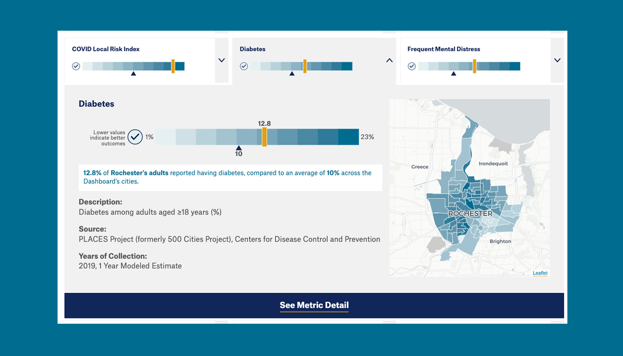
The City Health Dashboard’s goal is to improve the health and well-being of people in communities throughout the United States. To do this, the dashboard provides city leaders and communities with an array of regularly-updated data that is specific to neighborhood and/or city boundaries.
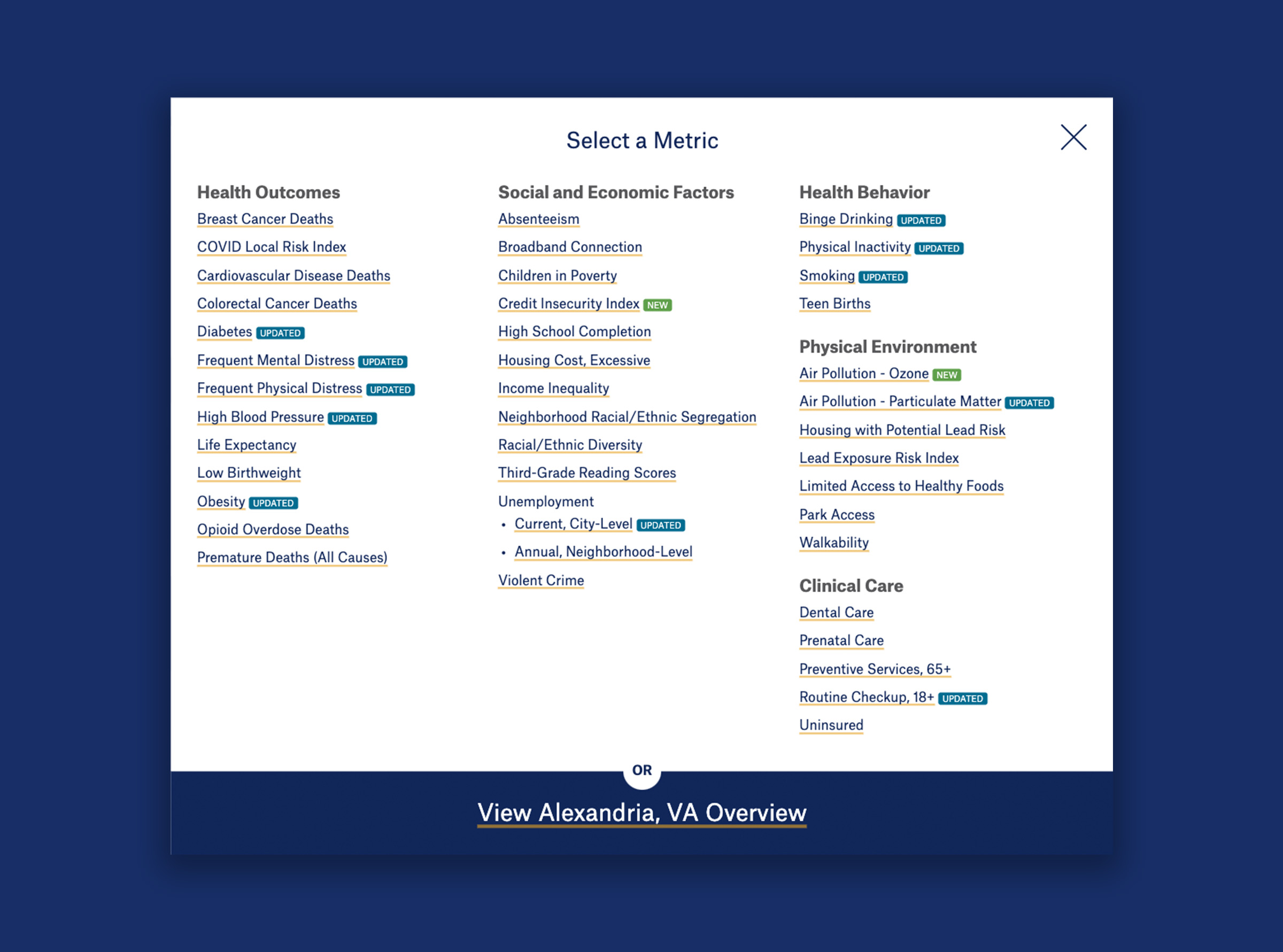
Forum One designed and developed the City Health Dashboard with NYU Langone Health’s Department of Population Health to share and compare data on 37 measures of public health across more than 500 U.S. cities. With powerful tools to explore and analyze the data, the City Health Dashboard is a one-stop resource for comprehensive, reliable, and actionable data to help America’s cities build healthier and more equitable communities.
Data Visualizations that Drive Action
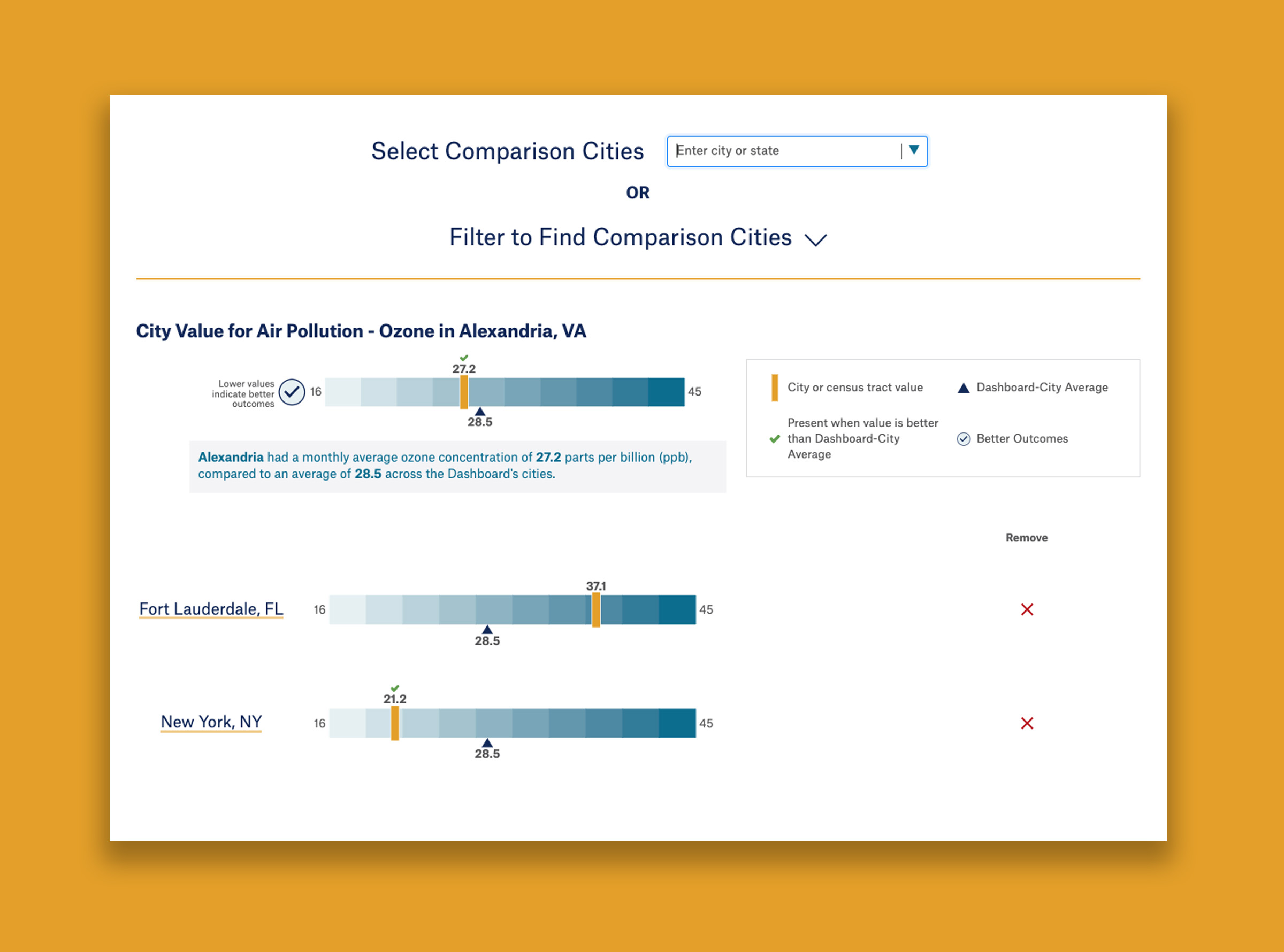
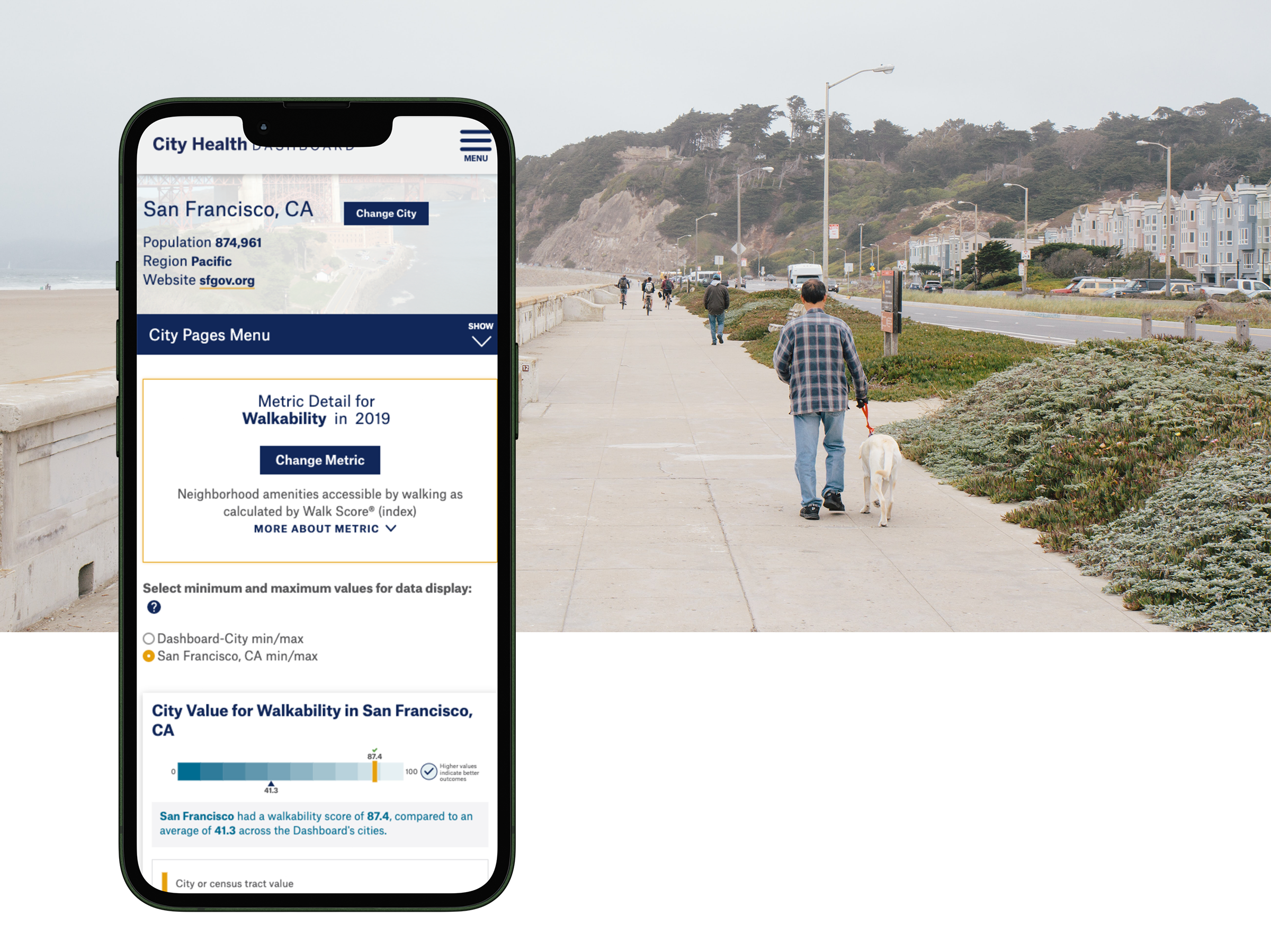
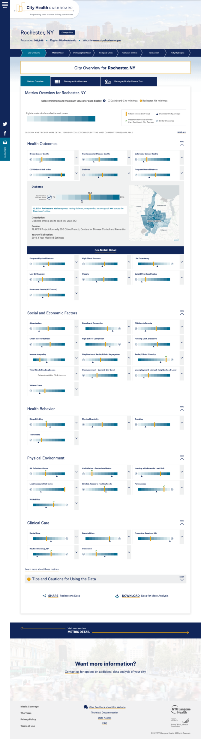
We designed and built an “all metrics view” that gives each city a quick, easy-to-scan scorecard summarizing how it’s performing across metrics. The user experience allows visitors to quickly navigate to the information they are looking for. We even created dynamic “sensemaking” statements that update as a user explores the data visualizations to help interpret and explain the numbers and put the data in context.
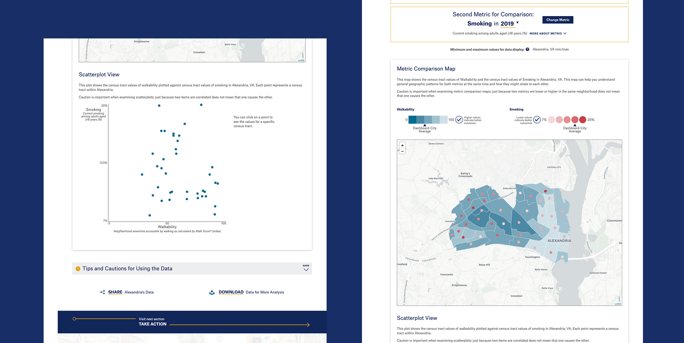
The site’s interactive comparison tool lets users compare multiple metrics within the same city, while powerful city comparison tools not only show how multiple cities compare on the same metrics but allow users to find cities similar to theirs based on either general characteristics or similar scores.
The Right Technology for the Job
Our team developed the Dashboard site in Drupal 8, with a React front-end, and developed the data management processes and procedures that power the site. We developed a robust suite of data visualizations, including D3 charts and graphs, and interactive maps built with Carto. The Dashboard site features a range of innovative and flexible data tools that let users uncover insights and connections.