Blog Insights
Evolving the Nation’s Report Card – Improving Data Visualization Through Usability Testing
In a recent post, Evolving the Nation’s Report Card – A Study of Designing New Reports, I discussed the design evolution reflected in two recent interactive reports for the National Assessment for Educational Progress (NAEP) program, the 2013 Puerto Rico Mathematics report and then the 2013 Vocabulary report.
After developing these reports, our team, including our partners at Educational Testing Services (ETS) and the NAEP team at the National Center for Education Statistics, turned to a larger one, the 2014 U.S. History, Geography, and Civics Report. For this report, the team made some additional fixes to the general design scheme and added some new techniques to continue improving these reports.
Landing Page
Following the spirit of the Puerto Rico and Vocabulary reports, we developed a prominent summary visual for the landing page. As you can see in the screenshot below, the feature displays the three different subjects, the overall score change from the prior assessment year, and the 2014 percentages at each achievement level.
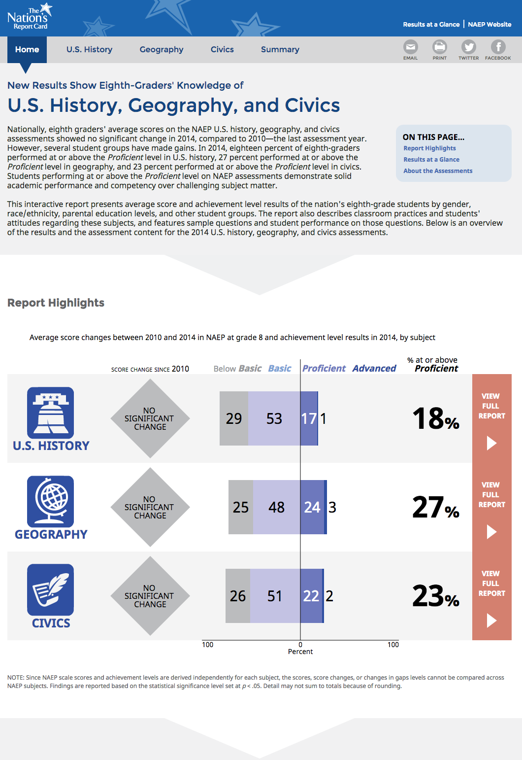
This feature appears to have done a good job of:
- Clarifying that the report contains results for three distinct subject assessments,
- Highlighting the major measures we report in the results, and
- Providing clear paths deeper into the results for each subject (via the red boxes at the right and the subject icons).
In retrospect, having a much smaller block of text at the top of the page would have made this feature more successful. We also might have made the feature itself a bit smaller, so that one could more readily see it all at once. This said, though, in usability testing, users were generally successful in understanding the nature of the report and finding a path to deeper information, so this general model continues to work.
One additional landing page element we added in this report is a substantial surfacing of “about the report” content on the bottom of the landing page. Users seemed to like having this accessible, and we see this being another element to continue using. On this report, though, there was too much of it, on reflection. In the future we will seek to have a small bit of critical background information and clear links to deeper sections.
Charts
Over the course of the reports we have developed a set of go-to charts that have worked well, although we are always working to refine them. Through our testing we saw some issue with understanding the legends in charts. In past reports, we placed legends below charts, a common approach. In many cases, though, the charts were tall enough that legends got pushed off-screen, hindering audiences’ ability to read the charts effectively.
As part of the broader rethinking of the navigation and site layout, we created room for legends on the right of charts, at least on laptops and greater screen sizes. Testing suggests this has improved legend access and chart reading in general.
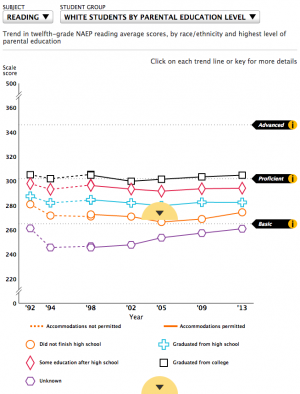
A quick look at the controls on the two charts above was also in order. Both of these complicated charts, presented a cross-tabulation of results for a racial-ethnic group by a second student group, in this case, levels of parental education. We determined that the wide control combining these two aspects, in the older report, was confusing. In the newer report, we split the two choices, which better explains the nature of the chart and lets users focus on one choice at a time.
We also addressed an ongoing issue with our gap charts, those that show the difference between two groups, jurisdictions, measures, etc. We always supplied the magnitude of the gap and we wanted to indicate whether or not the gap is statistically significant (that is, whether there is actually a gap). In many cases, we watched usability test participants ignore the stated gap value and simply eyeball or hand-calculate the gap values, missing key information.
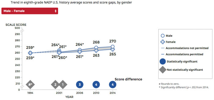
Moving the gaps values to the bottom of the chart and adding the bold indications of significance solved the issue amazingly well. Tests on this chart went immediately and strongly positive. We now have some visual language we can apply in other gap contexts, which is helpful.
In developing this report, the team also added some entirely new chart types, thus expanding our data visualization library. One successful addition was small multiple charts for displaying trends for all student groups side-by-side.
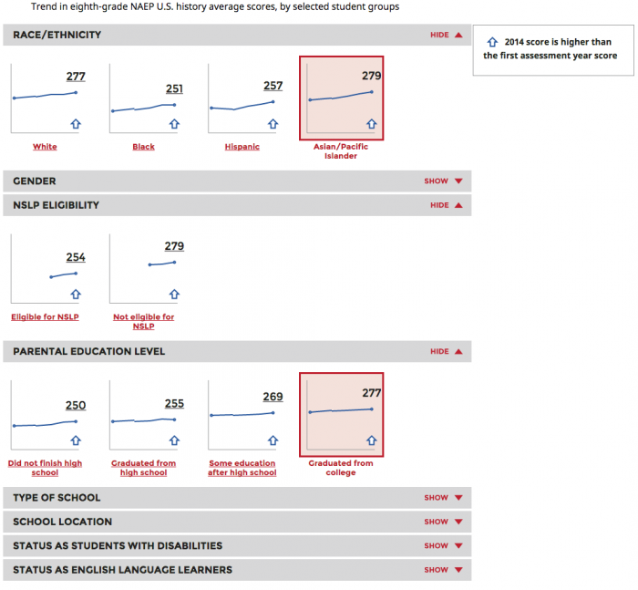
In previous reports, one could see one student group set at a time, so comparing across groups was difficult. This approach worked well and allowed broader comparisons. Selecting a single group opens a pop-up with a detailed trend chart.
The report also introduced not just a new chart, but an entirely new kind of analysis. The assessments always include student surveys that collect a wealth of contextual information about the students’ education in and out of school. Our partners at ETS have developed ways to aggregate some related questions into indices that show how a set of contextual factors and score performance interrelate. This output provides valuable additional insight, but is hard to grasp and visualize.
We created a visualization for this report, but it is not working well (it is also not a disaster). This result should not be surprising, as we are in new territory. This will be an data visualization area we will need to explore further – through prototyping and usability testing – to find a better solution. This situation is good and normal. Breaking ground is about developing hypotheses, testing them, and iterating.