Blog Insights
Good Data Visualization Practice: Slopegraphs
The series stems from our work with the National Assessment of Educational Progress (NAEP), the U.S. Dept. of Education program that provides the most comprehensive picture of students’ academic progress and performance (Forum One works on NAEP as a subcontractor to Educational Testing Services (ETS). We use many data visualizations, but need to keep an eye on what others are available, and so might you. In this entry, I turn to slopegraphs.
What Are Slopegraphs?
Slopegraphs are a great means for comparing data point, often between two points in time, but also on other dimensions. As Andy Kirk says, “The typical application for using a slopegraph is for a before and after story.” They plot two data points, or sets of pairs of data points, on parallel, vertical scales, connecting each pair by a line. The slope of the line shows the degree of difference between each side of the pair.
Slopegraphs are creations of Edward Tufte, who first introduced one in his 1983 book The Visual Display of Quantitative Information. It seems they were little used for some time, but have recently re-emerged.
Below is a good example of a basic slopegraph from a recent Pew Research Center report on views of homosexuality across different Christian denominations:
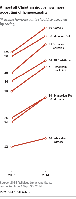
You can see the left side shows percentages holding a view in 2007, in appropriate relative places on the axis (even though there is no actual axis line), and the right side shows the percentage for each of the denominations in 2014. The upward slopes show the across-the-board great acceptance of homosexuality between the two years extremely clearly.
So are they just line charts, and why wouldn’t I just use a line chart? In a sense, they are line charts, assuming one is comparing times, but they are worth thinking about as their own chart type. Most importantly, the chart above is focused on the overall change between the periods, not changes in each year or intervening period. If you want to talk about a macro change, slopegraphs cut out the middle and focus on the main story of the change. Slopegraphs also do not purport to show a trend, ducking the issue of a trend needing at least three points. They are just showing the two points and a change between them; the line is serving as the means to express the change. Again, if the change is the story, slopegraphs are a great tool for focusing on that aspect.
How and When to Use Slopegraphs – Some Resources
There are couple good existing resources on slopegraphs and some further examples that may be useful.
- Edward Tufte’s “Slopegraphs”, by Charlie Park, gives an excellent overview of slopegraphs, including more about when and how to use them, some history of them, and a number of examples. In particular, it shows some examples that use variants of the basic chart above: comparison of two variables, changes in rank as opposed to on a scale, and slopegraphs wil multiple years. There is good discussion of how these do or don’t work.
- Park then did a follow-up, A Slopegraph Update, with more examples, variants, and discussion.
- More on slopegraphs on the Storytelling with Data is another useful overview, briefer than Park’s and with some further examples. Also includes an Excel template for making slopegraphs.
- Slopegraphs for comparing gradients: Slopegraph theory and practice is a piece by Tufte himself that includes examples Park used.
- In praise of slopegraphs by Andy Kirk on Visualizing Data gives another example that has useful discussion.
- There is a nice slopegraph in this NPR piece: How Far Your Paycheck Goes, In 356 U.S. Cities. This is a good example of a use for cases other than comparing years.
- Coal, Gas, Nuclear, Hydro? How Your State Generates Power is another NPR piece that mixes slopegraphs to show changes in energy sources over time and small multiples to show this for each state.
When have I seen slopegraphs not work?
In our work with NAEP, we have tried to apply slopegraphs and had to turn away from them (we did use them once). There were three issues that came up:
- Slopegraphs are most useful if there are notable changes / differences to highlight. If there are not, they can look like ladder and not be as engaging.
- If you have a number of data pairs and are comparing, say, changes in scores, you may find a number of pairs bunch up, as we did. In such cases, slopegraphs are just not going to work out well.
- We provide interactive graphics, including ones where users can change years for comparison. We briefly toyed with using slopegraphs in such a context, but when you start changing years, but the horizontal distance between the axes doesn’t move, the slopes start showing different changes that are just due to the change of time, and this isn’t immediately apparent to the reader. Even though the graph shows only the change for the two selections, you need to make sure the visual comparison in cases of interactivity will be consistent.
The articles above, especially Park’s, detail further dos and don’ts.
Two case studies: transforming pies and columns to slopegraphs
You can see more examples of this exercise in the pieces above, but I thought it would be instructive to take some actual published graphs and transform them into slopegraphs in ways that improve them. I have worked with the USDA’s Economic Research Service in the past and have chosen two of their Charts of Note from the last few months.
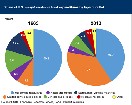
The first example is of side-by-side pie charts showing percentage distributions between two years, 1963 and 2013. Pie charts have some well-discussed issues that come into play here, but the big story, that limited-service eating places have grown substantially as a share of away-from-home food expenditures at the expense of most other types, does come out. This is not a bad chart.
If we create a slopegraph with the same data, though, I would argue it becomes better. The downward changes in most categories become quickly apparent, while the upward change for limited-service eating places really pops. I added to this with color, but that is really just a cherry on top.
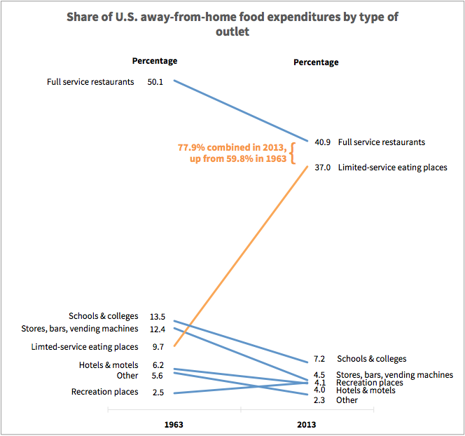
There are two weaknesses about my version versus the original. One is that that the pie actually makes it more apparent that full service restaurants and limited-service eating places so dominate in 2013. I addressed this by annotating my version, and I think this works well to mitigate the issue, arguably helping nail this point. The other issue is the bunching at the bottom in 2013 in particular. It is not catastrophic, but you can see how slightly different data could lead to a mess there.
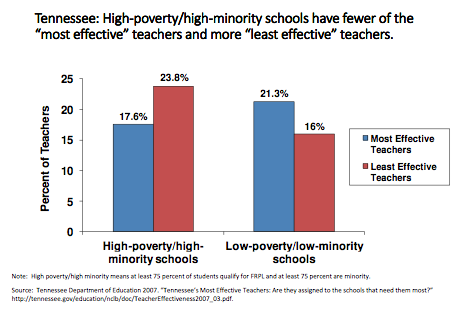
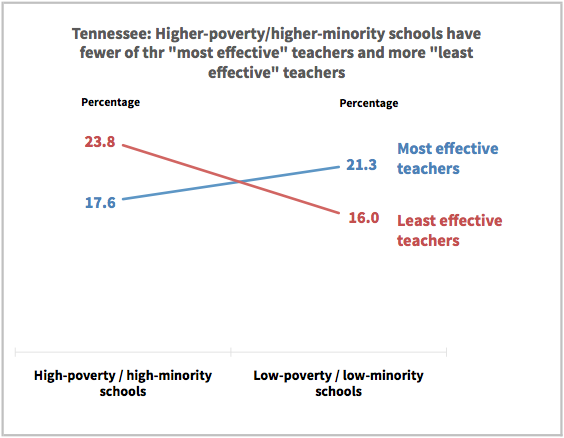
Here is a case with column charts and a non-time-based comparison. I found this chart by the organization The Education Trust in a presentation comparing the distribution of different levels of teachers in schools with different socioeconomic populations in Tennessee. It is a straightforward column chart that does its job. There is nothing significant wrong with it and it works well. Can it be even cleaner and clearer, though?
I again argue the slopegraph version with the same data helps make the story just a little clearer. The advantage of slopegraphs is that they strip out so much of what Tufte calls “ink” – the non-data aspects – that one can focus more on the story. The slopes provide a clear crossing pattern, underscoring the difference between the two types of schools. That is the main story and the slopegraph version focuses on that aspect.
If you find yourself wanting to tell stories with data where the focus is on comparisons – before vs. after, some time ago vs. now, this case vs. that case – consider slopegraphs for the visualization. They elegantly show these kind of relationships and give you a new, but clear, way to convey your data.