Blog • Insights
Good Data Visualization Practice: Small Multiples
I have written recently of our work with the National Assessment of Educational Progress (NAEP), the U.S. Dept. of Education program that provides the most comprehensive picture of students’ academic progress and performance (Forum One works on NAEP as a subcontractor to Educational Testing Services (ETS). Through ongoing review of the reports and related products we have designed and developed, including through usability testing, we seek to identify ongoing opportunities for improvements in their presentation and usability.
One key aspect of this work is reviewing the latest ideas on data visualization practices. This piece is the first in a semi-regular series designed to educate our team – and others who are interested – on good data visualization practices. Today’s topic: small multiples.
What are small multiples?
Small multiples are sets of charts of the same type, with the same scale, presented together at a small size and with minimal detail, usually in a grid of some kind. The term was at least popularized by Edward Tufte, appearing first in his Visual Display of Quantitative Information in 1983. He says of them:
Small multiples are economical: once viewers understand the design of one [chart], they have immediate access to the data in all the other [charts]… as the eye moves from one [chart to the next, the consistency of the design allows viewers to focus on changes in the data rather than on changes in graphical design.
By setting these multiple small charts adjacent to each other and ensuring uniformity in how each data series is presented, you naturally create a structure that is well tuned for comparison. The changes pop out, creating paths deeper into particular stories.
How and when to use small multiples – some resources
Many others following Tufte agree: for cases where comparison of many series is desired, small multiples represent an excellent data visualization strategy. Below are some articles that eliminate the subject nicely:
- An Introduction to Small Multiples, featured on the Infragistics website, nicely shows the advantages of small multiples, contrasting their use with an animated GIF and a big chart that overlays them all. The examples show how this chart time can be used nicely to show changes across a number of values over a period of time (population of a set of countries in six-year increments) as well as trends for each of a set of countries. It particularly points out the advantages of small multiples when there are two series to show per multiple.
- Another good introduction, Better Know a Visualization: Small Multiples, comes from Zach Gemignani on the Juicebox site. It highlights some of the same advantages mentioned above, uncluttered comparison and focus on data, as well as some “gotchas” in the use of small multiples. Let’s underline here: small multiples must have the same axes, use the same chart, be the same size, and show the same measures. The must be simplified and logically ordered. It then offers its own examples, happily some different ones then in the piece above. There are small multiple maps, a simple column diagram, and a relatively complex line set chart for each of the 50 states. It ends with a useful set of resources.
- How to Make Interactive Linked Small Multiples by Jim Vallandingham on the site Flowing Data takes the discussion of small multiples further by discussing ways to add interactivity to small multiples. Vallandingham presents examples of small multiple visualizations where you can filter the data (show only men for time spent on a set of activities), sort the small multiples, highlight particular items that stand out or are in focus (e.g., a particular selected country), and “scrub” the charts to see particular points in more detail. The piece then provides a tutorial for making the “scrubbable” charts in D3.
- As a final entry into the reading list, there is the much longer, deeper, and broader A Big Article About Wee Things by Lena Groeger of ProPublica. She showcases small multiples in myriad forms, explaining in more depth why they work and when they work. In so doing she makes broader points about good practices in user experience and interaction design. Waldo, of “Where’s Waldo” fame is your host, of sorts. It is well worth the more extensive read.
A case study in adopting small multiples
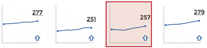
We have introduced small multiples to NAEP reports as a way to show score trends across the large number of student groups on which we report. Below, you can see the way we showed student groups data in the past on the 2013 Mathematics and Reading: Grade 12 Assessment report.
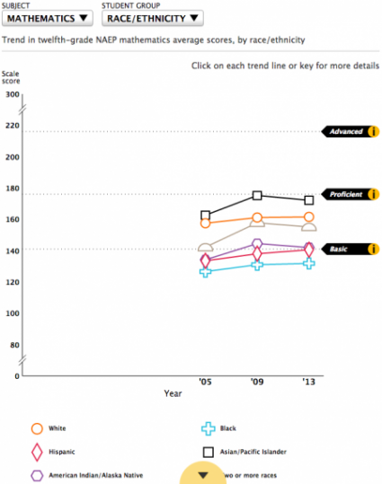
Here we showed all of one type of group (e.g., race/ethnicity) at full size on the same chart. This approach does have some advantages. You can see more detail across the selected groups, and, in some ways, you can compare among them more easily since they are in the same chart. There is also more information immediately apparent, such as the score trend in relation to the achievement level cut points. One might also argue it is more compact and relies on fewer controls, especially since we are handling subject selection differently now.
This all said, this approach has some notable weaknesses. While you can see more within a student group type, you cannot easily see, for example, a racial ethnic group’s performance versus that of, say parental education groups. Furthermore, six lines densely packed a a single chart does not necessarily make comparison easier, even if we used a more, toned down color palette. A lot of data in a small space can be confusing to readers, a phenomenon Stephen Few calls overplotting (PDF).
For these reasons, we introduced small multiples to display this same data. This chart comes from the 2014 U.S. history assessment report: