Blog • Insights
5 Ways to Tell Your Story with Data
Data is the new black. These days, everyone is releasing it, visualizing it, aggregating it, and mashing it up. And for good reason. Data is so much more than a stack of numbers or a server filled with client outputs. It can justify the work that your organization is doing and offers exciting new ways to motivate others to help your organization solve problems.
Chances are your nonprofit, government agency, foundation, or research institution has a lot of data just sitting around. It’s hidden in white papers, policy briefs, and fact sheets. It’s locked away in project output reports and research Excel files.
Given the attention that data gets from the media, influencers, and Capitol Hill, we believe that every communications department is obligated to look closer at their data, at how they are using it, and consider how to optimize data collection and management to achieve organizational goals.
One effective way to transform your data from an afterthought into a powerful communications product is through visualizations that help tell your story. Here are five ways to show your stories with data.
1. Let the numbers speak for themselves
Numbers are a universal language. You can make a big impression on site visitors just by presenting numbers clearly and in context with your web content. Numbers can provide an overview of who you are and what you do. On the Forum One website, we display the scope of our experience and knowledge with a few key data points: number of clients, number of projects, satisfaction scores, and how long we work with clients. If you have compelling impact numbers, don’t be afraid to simply show them.
2. Reveal change
My favorite example of this technique is Nathan Yau’s look at the rise of obesity in the United States. By using simple squares to represent states, a technique called “tile maps”, and showing the entire data set in one single view, we can quickly see how America’s waistline has ballooned since 1987.
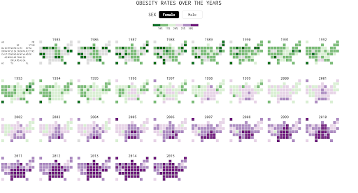
Many of the stories we would like our site visitors to understand are centered around revealing the truth behind a situation. The truth can become obvious when you visually reveal how data has changed. Simply remove everything except the changing data, and your data will suddenly reveal a compelling story: that conditions are worsening, attitudes are shifting, or improvements are being made by the work of your organization.
3. Provide context
Users need a grounding point to understand data. They need something to put into perspective. When telling your story with data, look outside your own data set to find other data points that make your story more accessible and intuitive. For example, the Billion Dollar Gram by David McCandless uses the simple comparative size of blocks to put “a billion dollars” into context.
We do similar work with the County Health Rankings & Roadmaps project, a collaboration between the University of Wisconsin’s Population Health Institute and the Robert Wood Johnson Foundation. The platform uses data to show how where we live matters to our health.
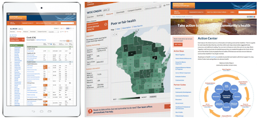
For the past seven annual rankings, Forum One has developed responsive, increasingly-sophisticated data visualizations and maps that allow users to explore and compare detailed public health information across 65+ health factors and outcomes for more than 3,000 counties. Counties can compare their health data to that of other counties nationwide. For example, a visitor from Yakima County in Washington state could easily see that they have 63 teen births for every 1,000 females ages 15-19 compared with 17 for neighboring King County. Using the “What Works for Health” tool, they can then find scientifically-supported policies and programs that can help address the issue in their county. Being able to compare data in other locations allows users to have perspective about the data in their own environment.
4. Allow users to explore, discover and control
Another powerful way to reveal your story through data is to move beyond infographics into interactive tools that let users take control of the data themselves. The best interactive data tools make it simple for users to jump into the data. Here are a few tips:
- Don’t just start with a blank canvas asking users to select mysterious indicators, metrics or variables. Instead, provide the user with a pre-selected set of data that already tells a story.
- Don’t try to give someone every piece of information, but rather provide tools enabling them to manipulate the data.
- Think through the most common way a user would like to approach the data and provide one or two data-manipulating tools that help them on their way.
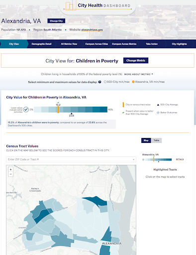
We created the City Health Dashboard, a Robert Wood Johnson Foundation-funded project led by the Department of Population Health at NYU Langone Health, which allows people to explore health in their city in a variety of different ways.
People can learn more about how health outcomes may be impacted by social and economic factors or physical environment by selecting two metrics to view at once (diabetes and unemployment, for example), or get a skimmable scorecard of their city as a whole. It also has powerful city comparison tools, which offers the ability to find cities similar to yours based on either your city’s general characteristics or scores.
5. Summarize and explain
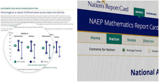
Sometimes the data is too complicated to leave by itself, and you want to make sure it’s telling the right story. The National Assessment of Educational Progress (NAEP), a Department of Education program, assesses students nationwide on reading and math performance through the Nation’s Report Card.
We work with NAEP to design and build more engaging, interactive reports that make it easier to uncover, understand, and engage with the assessment results. The results are important, but, as they can be very dense, we focus on presenting a clear and concise presentation of the main stories and notable trends.
If you’ve got interesting data that can move your mission forward, what are you waiting for? Get out there and start transforming your organization’s locked-up data into powerful stories.