Blog • Insights
NYU’s City Health Dashboard – Distilling Complex Data for Action
At Forum One, we love big, ambitious projects that solve big, intractable problems. So when NYU Langone Health asked us to create a dashboard to aggregate and present 36 diverse healthcare metrics for each of the 500 largest cities in the United States, we knew that we had to come up with a model that ensured that the data was clear and actionable.
With funding from the Robert Wood Johnson Foundation, the Department of Population Health at NYU Langone Health set out to create a resource that would, “equip cities with a one-stop resource for comprehensive, reliable data to help them build healthier and more equitable communities.”
The end result: the new version of City Health Dashboard. Large city leaders at various levels can now see how their city stands nationally on all 36 metrics, and can drill down to the census tract and/or demographic group level for many. They can also compare their city to others they know, or others with comparable characteristics, and can compare two metrics to each other. It’s powerful information for making positive changes.
You may realize the complexity involved in providing this much data in an accessible way for audiences that may or may not be healthcare or data experts. The following are some key design decisions that we made during our work with NYU to allow audiences to make sense of all this rich data.
Design for Success
There are many ways to show data, but if you pick one that doesn’t bring about the results or actions you want, your work may be for naught. Clearly define what audiences should do with the data you want to present, and then make that your North Star for all decisions going forward. As each idea comes up, match it to your goals: “will this content/feature/design choice lead to the desired action or impact we want?” If yes, keep it; if no, put it aside.
In this example, NYU knew that it wanted to see improved healthcare outcomes in large American cities. This was their firm goal from the outset, and we made sure that it remained a key and constant point of discussion. To achieve this end, they developed, and the team solidified, a model for change:
- Focus on city leaders: mayors and staff, city councilors and staff, department leads, and those working in neighborhoods in both public and private capacities.
- Bring previously disparate data together in one place: make it clear and focused to the city leaders audience, and enable them to access it, find new insights, and enact positive changes.
By maintaining its firm goal to improve healthcare outcomes, NYU was able to follow a barometer of success that provided a clear design foundation from which all else followed.
Know the Data
Once you have established your goal and the model for bringing about the change you want, focus your attention on the available data itself. Does it actually support what you want? This is not about the extreme of mistaken conclusions; rather, the more innocuous collection of data that is interesting but doesn’t speak to the audiences and their needs in respect of the goals.
To do this, you must confront a deeper level of knowing your data: determining what it looks like and, if you are bringing multiple sets together, how they will look together. When aggregating, this is a potentially tricky problem that may bring about tradeoffs. Suppose data set #1 is in percentages where higher is better, and data set #2 is in dollars, and data set #3 is in percentages where lower is better, and data set #4 is in raw numbers. Can you compare across these if necessary? And if so, how can you do it in a way that is clear to your audience?
Unifying disparate data was a big challenge for the City Health Dashboard project. Across 36 metrics, the data has different units, goes in different directions (in terms of what constitutes a “good” versus “bad” result), and, in a couple cases, had a “best” outcome in the center versus one end or the other. Some data is only available at the city level, and some extends to census tracts and/or demographic groups. Based on this alone, we knew we needed to create a tool that accounted for these complexities in a clear way.
Our solution was to create a simple visualization that served as a lowest common denominator, allowing audiences to see each metric against its full range and the national 500 city average.
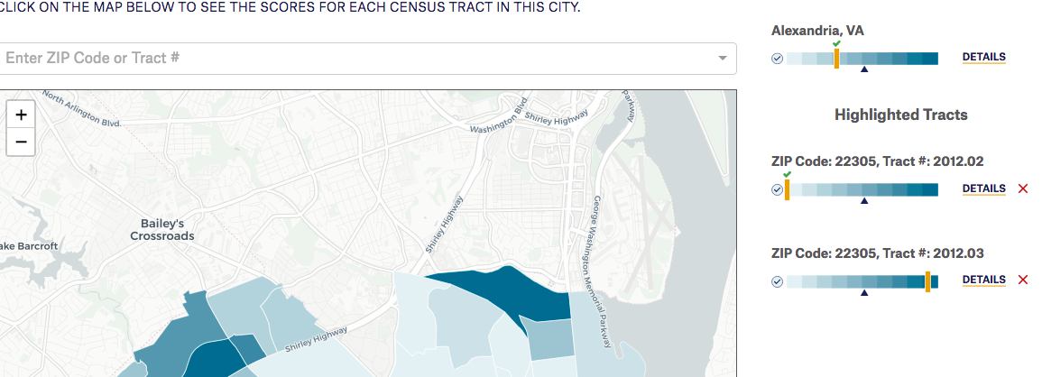
In the screenshot below, each bar represents the full range of scores for one of the metrics, and the yellow line is the selected city’s value for that metric. The navy-blue triangle marks the national 500 city average, so one can quickly see how the individual city compares to all the other cities collectively. The gradient and the checkmark establish which end of the scale is “good” performance. This simple structure allows audiences to see and interpret all metrics side-by-side, even though they are fundamentally different.
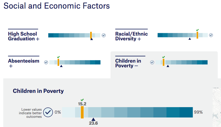
As mentioned, some metrics are such that a high value is good, e.g., in an ideal world, third grade reading proficiency would be at 100%, while a perfect crime rate or incidence of health conditions would be at 0%. This aspect of the data presented the biggest challenge for display. Should we have all numbers ascending, as is generally expected, and leave it to the audiences to figure out “good” from “bad”, or, should we display the “good” end on the right in all cases, leaving some numbers to scale backwards.
Initial testing showed audiences more distracted by number ranges going in the “wrong” direction, so we made numbers always ascend and added the checkmark to the gradient to reinforce which direction is “good.” We will continue to test this solution as the dashboard gets used more and more.
Set the Initial Lens
When presenting a large and complex amount of data, overwhelming audiences is always a risk. When confronted with many options, which seems like a good thing, people tend to freeze up. This is the Paradox of Choice. To make an experience manageable, audiences need a narrow away to start their exploration, an initial lens with which to view the data. This initial lens helps focus their experience and also directs them towards achieving the site’s goals.
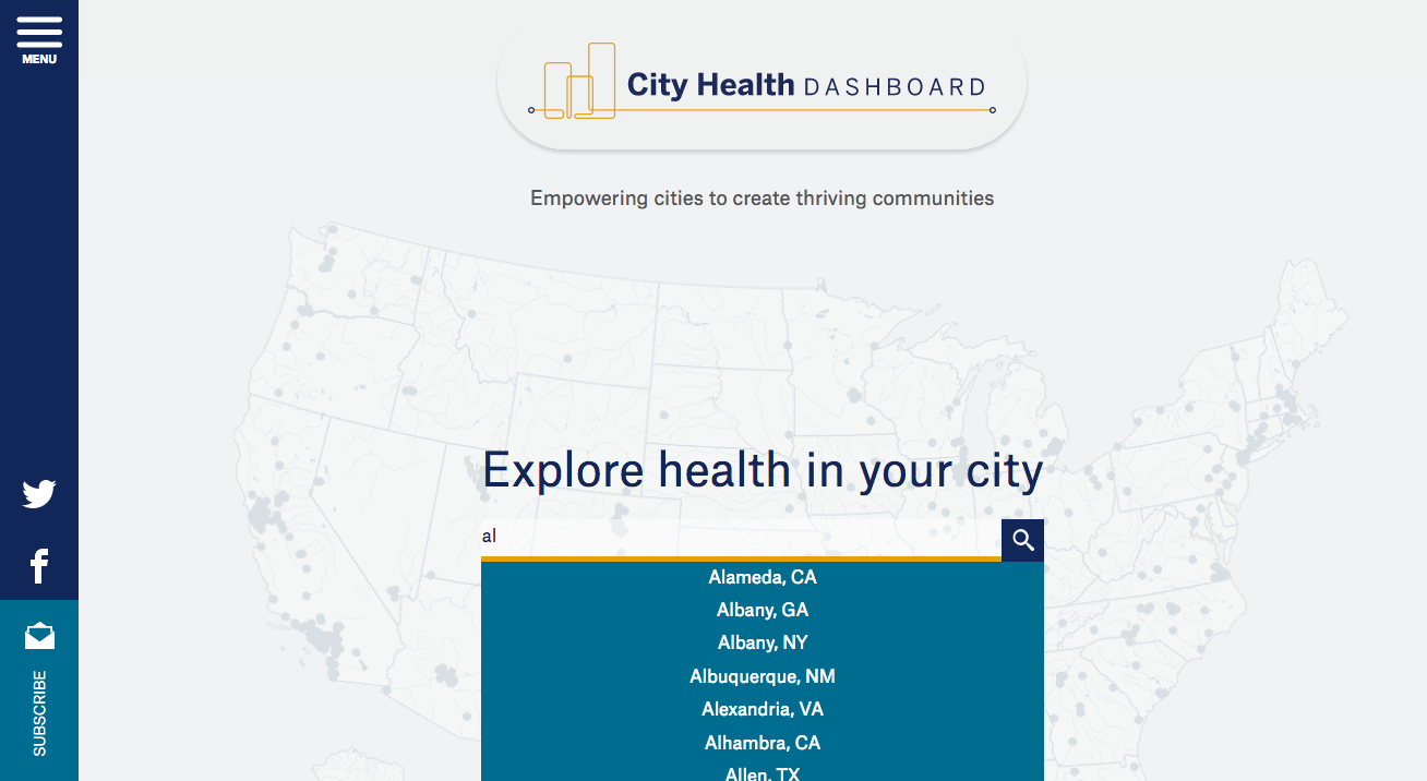
For this project, selecting the city level was a natural starting point. The first and prime call-to-action is therefore for audiences to search for “their” city.
The main thrust of the experience then happens inside the context of a single city, either focusing on that city or on comparisons to it.
Create a Hierarchy
While an initial lens is the first step to help audiences manage the complexity of the data, hierarchy adds guidance to help people throughout the experience. Establishing hierarchy means creating a consistent structure that governs how all information is organized and presented.
We designed the City Health Dashboard pages to maintain a rigid hierarchy of the city, the metric, and the successively deeper analyses. Once an audience member selects a city, s/he has to select a metric from the set of 36 as a next step. In doing so, we create further structure to organize the experience.
You can see the full hierarchy play out on the initial City View tab:
- Overarching city header, covering all the different analyses;
- The selected metric, governing this tab (yellow box);
- Overview chart, showing city-wide performance for the selected metric;
- The census-level detail, the deepest level of data.
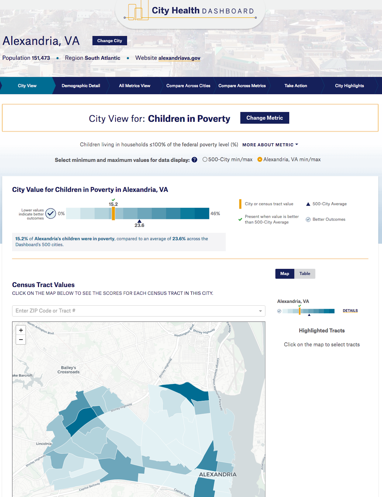
The clear hierarchy establishes an order that enables audiences to comfortably navigate the large amount and complexity of the data in order to better understand it and extract value from it.
Create a Visualization Language
With large data sets and multiple views of them available, it is critical that audiences be able to quickly and easily grasp any sort of visualization that is being shown. Much as we communicate successfully with those around us because we use the same terms to mean the same things, data visualization develops clear meaning through use of the same elements in the same way across contexts.
For the City Health Dashboard, we deliberately limited the number of visualization types and established commonalities between them. In so doing, we created a rigid visualization language that audiences could quickly start to recognize, follow, and understand.
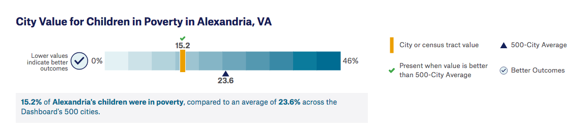
The above chart makes full use of the dashboard’s visualization language. From the first view, audiences know they are looking at a city’s score for a selected metric versus the entire range of values across the 500 cities and the average of all those cities. Additional verbal definitions or interpretations help those who are less comfortable with charts. The legend always sits to the immediate right, and it is always the same.
Below, audiences can look at specific census tract results if the selected metric includes that level of data. In the case of geographical visualizations, gradient colors translate to the maps, further tying visuals together and cementing understanding.
As the patterns hold, the visual language becomes more relevant. Audiences are able to dive further into the complexities of the data with the consistency to guide them.
A deliberate visual language benefits the development side too. In our case, it allowed us to build a base chart in D3 and then simply add modifications to accommodate different cases. This was a lighter lift than having to create numerous charts serving different purposes across the dashboard.
Conclusion
Complex data visualization projects succeed by tailoring broader, good user experience design practices for the specific needs of large data. As with all projects, a rigid focus on goals is critical. The goals of understanding the data, though, are unique to projects like this. As the data gets more complex, the need for structures that shape and guide the experience of that data becomes more and more acute. Create clear paths through the data, test your assumptions, and keep refining!