Blog Insights
The Need for Multiple Navigation Paths on Digital Properties

While online navigation is often designed with the intention to guide a user through the most logical and straight-forward path, each user is unique and will search and navigate slightly or very differently from the main path you’ve created. While I wrangle with and design for this reality in my day-to-day, a recent canoeing trip reminded me of just how necessary it is to provide not one, but multiple paths for users to make their way through and across digital properties. Last month I grabbed a few days off, and, as I am wont to do at such times, I put my canoe in Chesapeake Bay and went paddling. I was trying to briefly unplug from the digital communications world, but, there among the egret-clad creeks of Janes Island State Park, MD, I found a parable: that is, a parable from a paddle. Navigating the waterways there held the same limitations as a client’s proposed design for navigating a digital report. 

The parable: a one-way water trail

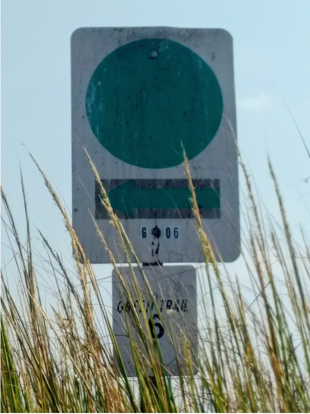
Janes Island is a pristine tract of woods and salt-marsh off the far southern end of Maryland’s Eastern Shore. It is, in fact, actually many islands, as the marsh is cut with creeks, small and large, creating myriad passageways through the seeming whole. It’s stunning — a riot of shore birds, marsh plants, fish, and other Bay creatures. It absolutely beckons the small boater to explore it. If you have ever paddled through a big marsh, though, you know it is pretty easy to follow a promising passage and end up at a dead-end of mud. Channels twist and turn and all look the same, and a large opening can quickly fade into a narrow backwater. To address these risks, the wise park managers created water trails: defined routes through the island marked by prominent signs.  Sign It’s a wonderful solution, and I’m sure the trails bring much more access to the wonders of the island, but they have one notable downside: they only run in one direction.  Signs like the one above work great, if you have chosen to paddle in the defined direction of that trail. These are waterways, though. There is no reason for one direction to be the defined way to go; in fact, with wind blowing as it was that day, I judged the “backwards” direction to be more advantageous. In going this direction, I found it much harder to find my way, as I had to find signs in unexpected places and think backwards from them. It was doable, but definitely a sub-optimal implementation of a good idea.

The digital case against a single navigation path

The one-way water trail struck me because I had recently had a conversation with a client about website navigation. Within a large digital report we designed and built, we had placed, at key points,  small sets of links to other, contextually relevant places in the report. A senior stakeholder suggested these links be removed. He worried they would distract from the main path through the report. He wanted, in essence, to create a one-way water trail.  Just as someone might choose, for good reasons, to paddle from the trail’s official terminus, audiences might choose to follow a non-linear path through digital content. It is, in fact, both easier to do and more likely to happen in this context. A report, for example, might cover topics X, Y, and Z, and be reasonably organized such that the reader gets an overview of each topic before proceeding into depth on each. If I come first to material that covers topic X, I might well want to go deeper on topic X, rather than first getting a once-over on topics Y and Z. Maybe I don’t even care about topic Z! Forcing me through it leaves me at the digital equivalent of a dead-end mudbank.  Digital navigation paths need to honor the possibility of audiences not taking a single, defined way through the content. This does not mean you shouldn’t present a recommended path, but it does mean you have to provide sign-posts that support alternative directions, or imagine arriving from different starting points. On a prior version of the same report, more than half of all entrances over the first year of the report’s life were to pages other than the prescribed initial one. Remember, in the salt marsh, I can’t pick up my canoe and drop it in the middle of the trail, but Google does this all the time with your readers. Now, there are obviously limits. I wouldn’t want five, slightly different signs at every turn in the marsh, as that would mar my view and would start to force me to think too much about decisions. In the same way, too many links in too many places on a site is highly counter-productive for both usability (too many choices overwhelm users) and design (too much visual noise and no focus). Balance is important.

Developing an effective multi-navigational approach

Your audiences want to be able to navigate your content in the way that makes sense to them. It is your job, as a site owner, to provide the right amount of guidance for doing so, to provide the right signposts. So how can you do this?

1. Understand your target audiences 

Do research and understand how your highest priority audiences are most likely to want to engage with your content. At Janes Island, for example, some paddlers will be eager to just follow a set direction, but others may be worried about paddling into a strong wind or may have a set location in mind for, say, fishing. On the report, identifying the set of audiences that are just interested in Topic X and Y, but not Z, is important.

2. Know your content

Make sure you have a clear knowledge of your content, what it offers, and how it can and should be used. The water trail builders did this well in looking at the natural structure of the island and identifying a mix of trails: short vs long, open vs protected, by woods vs all marsh, etc. Likewise, know what of your content is key for you and what is key for audiences, and how these might interrelate. 

3. Create a clear information architecture 

Even when trails exist, one way to ensure clarity of navigation is a map. In a canoe, one can get an overview of the whole area, pick out orienting land features, judge distances, and so on. Online, the equivalent of a physical map is a good structure for the information on a property, its content. This includes a menu structure that uses audience-facing terms and groupings and similarly meaningful metadata, e.g., content type and topic. This solid information architecture will provide a sense of the whole, and an ability to find the kinds of content most useful for an audience-member’s task.

4. As needed, create established navigation paths

Some cases, such as a report or a campaign, might demand deliberate paths, i.e., ‘here is our editorial take on the best way to understand this report.’ These are the trails on a physical map. This probably will come simply from ordering content into a logical flow, either on one long page or a series of well-connected pages. In such a case, though, also plan a small number of alternate paths based on audience needs, i.e., ‘are you really interested in Topic Y? Here is the direct path to the deep dive on Topic Y.’ These are links across the main trail, allowing audiences to approach it differently if their needs demand it. 

5. Be judicious

Keep alternative paths to a minimum, based on audience needs discovered in the research. Too many links, like too many signs, is a distraction.

6. Test and validate

Get audiences to navigate your content and ensure they can do so successfully. Update as needed and retest.  Trails are wonderful and powerful ways to help people explore and to show off the best of what you have to offer. Thoughtful design can turn a good path into a great one.  

Written by

Are you ready to create impact?

We'd love to connect and discuss your next project.